Understanding Retina Displays and Media Queries
Apple revolutionized screen quality with its Retina display. This technology offers incredibly clear, vibrant, and detailed images. However, it also presents a challenge for designers and developers. If images aren’t optimized for Retina displays, they won’t look as good as they could.
In this article, we’ll explore how to serve images that look great on high-resolution screens.
A Guide to Better and Sharper UI Icons with Web Fonts
Are you using bitmap images like PNGs and GIFs for icons on your website? If so, you might... Read more
How to Use Vector Graphics
Firstly, if your images don’t need to look realistic or have complex colors, vector graphics are likely your best choice. Unlike raster images, vector graphics aren’t pixel-based, so they’ll look crisp and clear on any screen size.
You can add vector graphics to your website in several ways, such as using SVG, Fonts, or Canvas. Here are some resources to help you:
How to Use Media Queries
Media Queries allow you to deliver optimized graphics based on screen resolution. Unlike typical Media Queries that focus on viewport width, these queries target the device’s pixel ratio and screen resolution.
@media only screen and (min-device-pixel-ratio: 2),
only screen and (min-resolution: 192dpi) {
  /* Style Rules */
}
The example above sets styles for screens with a minimum device pixel ratio of 2 or a minimum resolution of 192dpi.
You can calculate the DPI (dots per inch) by dividing the screen resolution by its diagonal size in inches. For instance, a 13.3-inch screen with a 1280×800 resolution has a DPI of 96. The example uses roughly twice that number (192dpi).
If you’re interested in the math behind device pixel ratios, check out this article by Boris Smush at HTML5 Rocks.
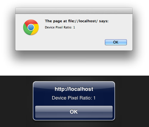
You can also find the device pixel ratio using JavaScript, as shown below:
var dpr = window.devicePixelRatio;
alert('Device Pixel Ratio: ' + dpr);
This will display the device pixel ratio on Retina screens like the new MacBook Pro and iPhone 4.

On non-Retina displays, the number will be 1.
Device Pixel Ratios for Popular Devices
Here’s a table showing the device pixel ratios for some popular devices:
| Device | Device Pixel Ratio |
| iPhone 4, iPhone 4S, iPhone 5, iPod Touch | 2 |
| iPad with Retina Display | 2 |
| Galaxy Nexus, Galaxy Note, Galaxy SIII | 2 |
| Kindle Fire HD | 1.5 |
| Galaxy S Plus, Galaxy SII | 1.5 |
As you can see, some HD screens have a 1.5 device pixel ratio. You might want to set your Media Query minimum threshold to 1.5 for broader compatibility.
@media only screen and (min-device-pixel-ratio: 1.5),
only screen and (min-resolution: 192dpi) {
  /* Style Rules */
}
Example
We’ve created a demo page that uses two image formats: a .png for standard screens and an SVG for HD screens. These are set using Media Queries.
a {
  background-image: url('img/hongkiatcom.png');
  background-size: 100%;
  background-repeat: no-repeat;
}
@media only screen and (-webkit-min-device-pixel-ratio: 1.5),
only screen and (min--moz-device-pixel-ratio: 1.5),
only screen and (-o-min-device-pixel-ratio: 3/2),
only screen and (min-device-pixel-ratio: 1.5),
only screen and (min-resolution: 192dpi) {
  a {
    background-image: url('img/hongkiatcom.svg');
    background-size: 100%;
    background-repeat: no-repeat;
  }
}
You can test this demo on both standard and Retina displays to see which image is displayed.
Additional Resources
- Towards a Retina Web – Smashing Magazine
- Supporting High-Resolution Screens in Views – Apple.com
- Unprefixed Webkit Resolution Media Query – W3.org
- High DPI Images for Variable Pixel Densities – HTML5 Rocks
- CSS3 Values for Resolution – W3.org