Mobile App Design/Dev: Custom Themes with jQuery Mobile
In our earlier jQuery Mobile tutorial I had introduced much of the underlying framework and how to go about setting up your first website. The JS library is both lightweight and easy to pickup in regards to learning difficulty. There is also generic a CSS stylesheet included with the files so you can further customize the elements in your layout.
For this second segment I’d like to spend a bit of time delving deeper into this idea of jQuery Mobile themes. The entire design industry has been revolutionized by jQM and the process of constructing a mobile template from scratch has been significantly improved. jQuery Mobile isn’t just a scripting library, but an entire ground framework to build upon and produce efficient mobile templates.
Recommended Reading: Mobile App: Beginner’s Guide to jQuery Mobile
Default Stylesheet Contents
I should begin by clarifying exactly what type of CSS code is included with the default files. The stylesheet from jQM 1.0 has been split into two main segments – structure and themes.
The structure code is the stuff you can mostly ignore. This is used to set margins, padding, height/width, font variants, along with many other browser defaults. The internal themes are then split up from A-E which each control different visual effects in your design. This can include background colors, gradients, drop shadows, etc.
Each of these inner theme elements can also be referred to as swatches. When you build a mobile template you’ll generally stick with a single theme. But in almost every scenario the design can be improved upon with differing color schemes. The default stylesheet only includes swatches A-E but you can build swatches F-Z to add another 21 alternatives into your theme library. Just to clarify these terms again a theme is considered 1 single CSS file which can include up to 26 different swatches labeled A-Z.
Switching Styles
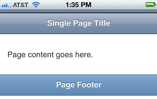
If you don’t choose to specify any swatches then jQuery Mobile will stick to the swatch A by default. If you weren’t already aware the jQuery Mobile docs utilize HTML5 data attributes for many internal functions. One of these includes changing swatches via the data-theme attribute. Check out my code example below to see what I mean.
<div data-role="page" id="mypage" data-theme="b">
  <div data-role="header">
    <h1>Default jQM Page</h1>
  </div>
  <div data-role="content">
    <p>Here is some internal content.</p>
    </div>
</div>
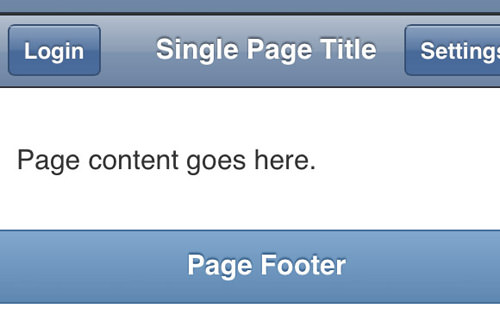
Notice that I placed the data-theme attribute on the root page div. This means the new swatch color will effect everything inside which includes both the header and content areas. I could additionally include data-theme="c" into the header div to change only that content from the rest of my page.
Components of a Swatch
It should be fairly straightforward how to implement these different swatches within a single layout. So now let’s take a look at the jQM CSS code so we can break down individual components of a swatch. Check out the latest jQuery Mobile 1.4.5 CSS file hosted on their own CDN.
You should notice how each swatch is separated by a distinct comment and each of the internal classes ends with the appropriate lettering. For example .ui-bar-a and .ui-body-a are applied into the header/footer bars and content areas by default. Most properties are implementing a reset on font and link colors, background gradients, and other small details. I included simply the ui-bar-a codes to give you an idea of which elements we target.
/* A
---------------------------------------------------------------------------------------------*/
.ui-bar-a {
	border: 1px solid #2A2A2A;
	background: #111111;
	color: #ffffff;
	font-weight: bold;
	text-shadow: 0 /*{a-bar-shadow-x}*/ -1px /*{a-bar-shadow-y}*/ 1px #000000;
	background-image: -webkit-gradient(linear, left top, left bottom, from(#3c3c3c), to(#111)); /* Saf4+, Chrome */
	background-image: -webkit-linear-gradient(#3c3c3c, #111); /* Chrome 10+, Saf5.1+ */
	background-image:    -moz-linear-gradient(#3c3c3c, #111); /* FF3.6 */
	background-image:     -ms-linear-gradient(#3c3c3c, #111); /* IE10 */
	background-image:      -o-linear-gradient(#3c3c3c, #111); /* Opera 11.10+ */
	background-image:         linear-gradient(#3c3c3c, #111);
}
.ui-bar-a,
.ui-bar-a input,
.ui-bar-a select,
.ui-bar-a textarea,
.ui-bar-a button {
	font-family: Helvetica, Arial, sans-serif;
}
.ui-bar-a .ui-link-inherit {
	color: #fff;
}

.ui-bar-a .ui-link {
	color: #7cc4e7 /*{a-bar-link-color}*/;
	font-weight: bold;
}

.ui-bar-a .ui-link:hover {
	color: #2489CE /*{a-bar-link-hover}*/;
}

.ui-bar-a .ui-link:active {
	color: #2489CE /*{a-bar-link-active}*/;
}

.ui-bar-a .ui-link:visited {
    color: #2489CE /*{a-bar-link-visited}*/;
}
If you’re just looking to create a custom swatch I recommend basing the template off one of the originals. The process will go a whole lot smoother if you start writing codes in a new CSS document. You won’t have the hassle of editing in the original file and you can start off working on a clean slate. But the key areas you want to focus on will include the following:
- header and footer bars
- body content & page text
- list styles
- button states default/hover/active
- form input controls(extra)
Coding a New Bar Design
From the same CSS file we looked at earlier copy/paste all the swatch A code(lines 12-150) into a new file. We can use the swatch name G to implement these new styles. Now after copying the code you want to rename each class instance ending in -a to -g, as this is how jQuery Mobile will recognize which styles to use.
I’d like to start by redesigning the header bar bg to mimic a more familiar iOS gradient. This can be done solely within the .ui-bar-g selector. We want to edit the background and background-image properties to change up the gradient effects. Check out my code below and a demo screen of the new gradient.
.ui-bar-g {
	border: 1px solid #2d3033 /*{a-bar-border}*/;
	border-left: 0px;
	border-right: 0px;
	background: #6d83a1;
	color: #fff /*{a-bar-color}*/;
	font-weight: bold;
	text-shadow: 0 /*{a-bar-shadow-x}*/ -1px /*{a-bar-shadow-y}*/ 1px /*{a-bar-shadow-radius}*/ #3e4957;
	background-image: -webkit-gradient(linear, 0% 0%, 0% 100%, from(#b4bfce), color-stop(0.5, #899cb3), color-stop(0.505, #7e94b0), to(#6d83a1));
	background-image: -webkit-linear-gradient(top, #b4bfce, #899cb3 50%, #7e94b0 52%, #6d83a1); /* Chrome 10+, Saf5.1+ */
	background-image:    -moz-linear-gradient(top, #b4bfce, #899cb3 50%, #7e94b0 52%, #6d83a1); /* FF3.6 */
	background-image:     -ms-linear-gradient(top, #b4bfce, #899cb3 50%, #7e94b0 52%, #6d83a1); /* IE10 */
	background-image:      -o-linear-gradient(top, #b4bfce, #899cb3 50%, #7e94b0 52%, #6d83a1); /* Opera 11.10+ */
	background-image:         linear-gradient(top, #b4bfce, #899cb3 50%, #7e94b0 52%, #6d83a1);
}
I’m using the blue color scheme found in most default iOS applications. My background is initially set to a solid color for devices which can’t render CSS3 gradients. Then below I’m using color stops around the 50% marker to recreate the traditional Apple-style glossy shine effect. Also inside the same selector I’ve slightly modified the text shadow with a more subtle color and range.
Buttons and Text Effects
It’s important when coding swatches to consider specifically which areas of the interface need attention. The header bar looks great with this new background, but one last modification I’d like to make will match the button styles closer to that of iOS apps.
.ui-btn-up-g {
	border: 1px solid #375073;
	background: #4a6c9b;
	font-weight: bold;
	color: #fff;
	text-shadow: 0 /*{a-bup-shadow-x}*/ -1px /*{a-bup-shadow-y}*/ 1px /*{a-bup-shadow-radius}*/ #40536d;
	box-shadow: none;
	-webkit-box-shadow: none;
	-moz-box-shadow: none;
	background-image: -webkit-gradient(linear, 0% 0%, 0% 100%, from(#89a0be), color-stop(0.5, #5877a2), color-stop(0.505, #476999), to(#4a6c9b));
	background-image: -webkit-linear-gradient(top, #89a0be, #5877a2 50%, #476999 52%, #4a6c9b); /* Chrome 10+, Saf5.1+ */
	background-image:    -moz-linear-gradient(top, #89a0be, #5877a2 50%, #476999 52%, #4a6c9b); /* FF3.6 */
	background-image:     -ms-linear-gradient(top, #89a0be, #5877a2 50%, #476999 52%, #4a6c9b); /* IE10 */
	background-image:      -o-linear-gradient(top, #89a0be, #5877a2 50%, #476999 52%, #4a6c9b); /* Opera 11.10+ */
	background-image:         linear-gradient(top, #89a0be, #5877a2 50%, #476999 52%, #4a6c9b);
	border-radius: 4px;
	-webkit-border-radius: 4px;
	-moz-border-radius: 4px;
}

.ui-btn-up-g .ui-btn-inner, .ui-btn-hover-g .ui-btn-inner, .ui-btn-down-g .ui-btn-inner { border-radius: 0; -webkit-border-radius: 0; -moz-border-radius: 0; }
.ui-btn-hover-g {
	border: 1px solid #1b49a5;
	background: #2463de;
	font-weight: bold;
	color: #fff;
	text-shadow: 0 /*{a-bup-shadow-x}*/ -1px /*{a-bup-shadow-y}*/ 1px /*{a-bup-shadow-radius}*/ #40536d;
	box-shadow: none;
	-webkit-box-shadow: none;
	-moz-box-shadow: none;
	background-image: -webkit-gradient(linear, 0% 0%, 0% 100%, from(#779be9), color-stop(0.5, #376fe0), color-stop(0.505, #2260dd), to(#2463de));
	background-image: -webkit-linear-gradient(top, #779be9, #376fe0 50%, #2260dd 52%, #2463de); /* Chrome 10+, Saf5.1+ */
	background-image:    -moz-linear-gradient(top, #779be9, #376fe0 50%, #2260dd 52%, #2463de); /* FF3.6 */
	background-image:     -ms-linear-gradient(top, #779be9, #376fe0 50%, #2260dd 52%, #2463de); /* IE10 */
	background-image:      -o-linear-gradient(top, #779be9, #376fe0 50%, #2260dd 52%, #2463de); /* Opera 11.10+ */
	background-image:         linear-gradient(top, #779be9, #376fe0 50%, #2260dd 52%, #2463de);
	border-radius: 4px;
	-webkit-border-radius: 4px;
	-moz-border-radius: 4px;
}
The code area we’re editing now is within the UI button classes. There are 3 different modes to be concerned with: .ui-btn-up-g, .ui-btn-hover-g, and .ui-btn-down-g. I’m mostly focusing on the standard(btn-up) and hover(btn-hover) effects by editing the box shadow and linear gradients. Also I expanded the rounded corners effect so the buttons appear more rectangular.
Because of this I’ve needed to remove the inner border radius from a class titled .ui-btn-inner. This class gets attached onto a span element within each anchor link in your header bar. Without resetting the border radius properties you’ll notice small glitches in the design whenever you hover over a button. As you spend more time coding in jQuery Mobile themes you’ll memorize these little nuances for future projects.
Introduction to ThemeRoller
If you enjoy getting your hands dirty in code then I highly recommend sticking to custom edits. Not only do you have more control but it’s a lot easier to debug issues within the CSS if you made all the edits yourself. But for many designers this process is tiresome and will simply take longer than necessary. Luckily the jQuery Mobile team has released an online editor under the name ThemeRoller.
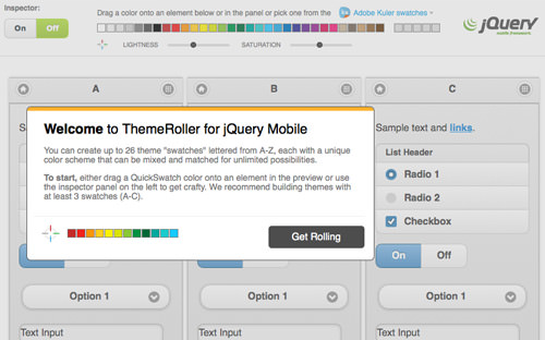
From this page you have access to edit the first 3 A-C swatches or even create one of your own. If you look in the left sidebar you can switch between these 3 settings or quickly make changes to the global theme options. These include CSS properties such as border radii, box shadows, or default page fonts. Notice as you select any of the preset swatches that we can edit only the same areas as before – top/bottom bars, body content, and the 3 button states.
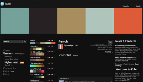
But my favorite feature has to be the direct access to Adobe Kuler swatches. You can actually create a few color schemes within your Kuler account and import them into ThemeRoller. The interface supports drag-and-drop functionality so it’s real simple to try out a few different ideas in a matter of minutes.
Ultimately there is no absolute method of properly building your jQM swatches. Some designers prefer to hard code CSS while others will love the intuitive ThemeRoller web app. As long as you’re following the class structure then you should get the same results either way.