5 Tailwind CSS Essential Tools to Boost Your Productivity
Tailwind CSS has changed how we build websites by using utility classes like text-center or bg-blue-500 directly in HTML.
But as projects get bigger, the huge number of utilities can become overwhelming, leading to long class lists, slower development, and a constant need to look up class names. So how do we keep the speed and flexibility without getting buried under the class chaos?
In this article, we’ll explore five essential tools that can help you stay productive while working with Tailwind CSS. These tools will help you manage your classes better, speed up your workflow, and keep your code clean and maintainable.
Let’s check them out!
1. VSCode Extensions
If you’re using a code editor like VSCode, you should install the Tailwind CSS Intellisense. This extension provides intelligent suggestions as you type, helping you quickly find the right utility classes without having to remember them all.
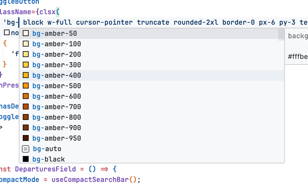
On top of that, the extension also offers features like linting for your Tailwind CSS code. This can significantly speed up your development process and reduce errors.
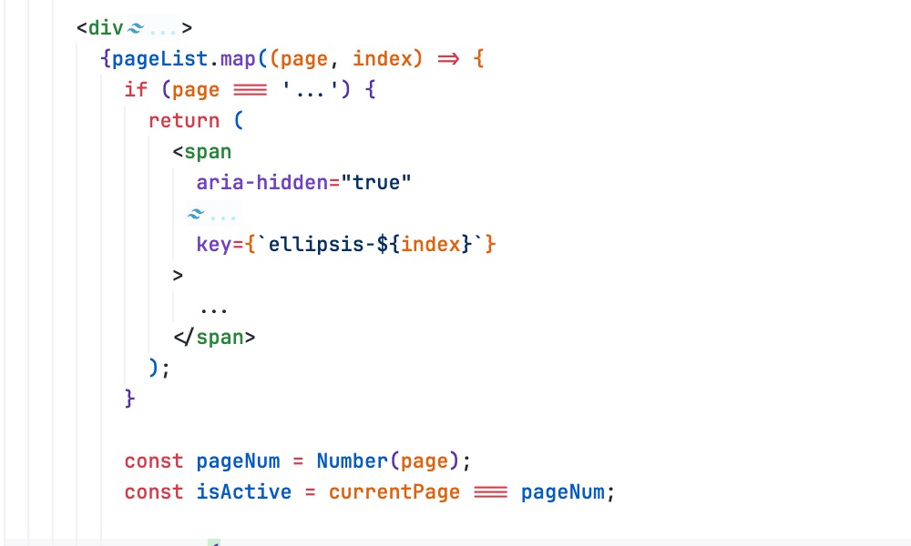
Another extension that I would suggest is Tailwind Fold. It is another useful extension that helps you manage long class lists by allowing you to collapse and expand them. This keeps your code clean and makes it easier to navigate through your HTML files.
2. Code Linting Tools
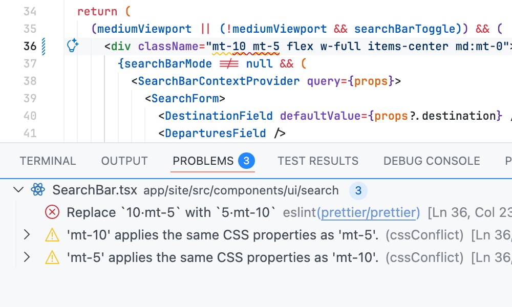
Linting and proper formatting are essential parts of maintaining code quality, and there’s one tool that I would recommend if you’re working with Tailwind CSS: the prettier-plugin-tailwindcss.
This Prettier Plugin is an official plugin from the Tailwind CSS team that automatically sorts your classes in a consistent order whenever you format your code.
On top of that it also removes duplicated classes, unnecessary whitespace, and ensures that your Tailwind CSS code is clean.
To install it, run:
npm install -D prettier prettier-plugin-tailwindcss
Then, update the Prettier config in your project to include prettier-plugin-tailwindcss.
{
  "plugins": ["prettier-plugin-tailwindcss"]
}
After you’ve configured it, I’d recommend installing the Prettier – Code formatter extension, if you’re using VSCode. This extension will allow you to format your code directly from VSCode using Prettier, as well as reporting any formatting issues.
3. Tailwind Merge
When creating reusable components with Tailwind CSS, like a Button that would expect custom classes, you’ll likely run into class conflicts. For example, what happens if a component has a default p-2 but someone passes p-5 through className?
Since Tailwind utilities are atomic, both classes end up in the final output. This is exactly the messy problem that the tailwind-merge package solves beautifully.
It is a smart little utility that cleans up conflicting classes automatically. It looks at all the styles you pass in, groups anything that conflicts, like that p-2 vs p-5, and returns only the correct one—based on a simple rule: the last class wins. For example:
import { twMerge } from 'tailwind-merge';

const classes = twMerge('p-2', 'p-5');
console.log(classes); // Output: 'p-5'
This makes component libraries in React, Vue, or Svelte much easier to manage, allowing you and the users to freely override styles without worrying about unexpected results.
4. Tailwind Variants
Another thing that can get messy is when you start adding different styles based on props in your reusable component. For example, a button might need multiple versions such as different sizes, colors, or states like disabled or loading.
tailwind-variants helps solve this problem by giving you an easy and organized way to define those style variations without all the clutter. Let’s take a look at an example below:
import { tv } from 'tailwind-variants';

const button = tv({
  // Base classes that apply regardless of variants
  base: 'font-semibold rounded-lg shadow-md transition ease-in-out duration-150',

  // Define the available variants
  variants: {
    // 1. Variant for color/intent
    intent: {
      primary: 'bg-blue-500 hover:bg-blue-600 text-white',
      secondary: 'bg-gray-200 hover:bg-gray-300 text-gray-800',
    },
    // 2. Variant for size
    size: {
      sm: 'py-1 px-2 text-sm',
      lg: 'py-3 px-6 text-lg',
    },
    // 3. Boolean variant for full width
    fullWidth: {
      true: 'w-full',
    },
  },

  // Define default values if no prop is provided
  defaultVariants: {
    intent: 'primary',
    size: 'lg',
  },
});
In this example, we set the base styles for the button, then defined variants for intent (color), size, and a boolean for full width. We also set default variants to ensure the button has a consistent look when no specific props are provided.
Inside your component, you call the button function with the desired props, and it automatically generates the correct class string:
// Example 1: Use defaults
const classes1 = button();
// Result: "font-semibold rounded-lg shadow-md ... bg-blue-500 hover:bg-blue-600 text-white py-3 px-6 text-lg"

// Example 2: Override defaults
const classes2 = button({ intent: 'secondary', size: 'sm' });
// Result: "font-semibold rounded-lg shadow-md ... bg-gray-200 hover:bg-gray-300 text-gray-800 py-1 px-2 text-sm"

// Example 3: Use the boolean variant
const classes3 = button({ fullWidth: true });
// Result: "font-semibold rounded-lg shadow-md ... (primary/lg styles) w-full"
5. Tailwind Config Viewer
As your Tailwind project grows, your config file can become large and difficult to navigate. With custom colors, spacing, utilities, and breakpoints, it’s easy for developers and designers to forget what’s available or where to find it. Searching through the file for a class name or color code wastes time and often leads to mistakes or hard-coded values.
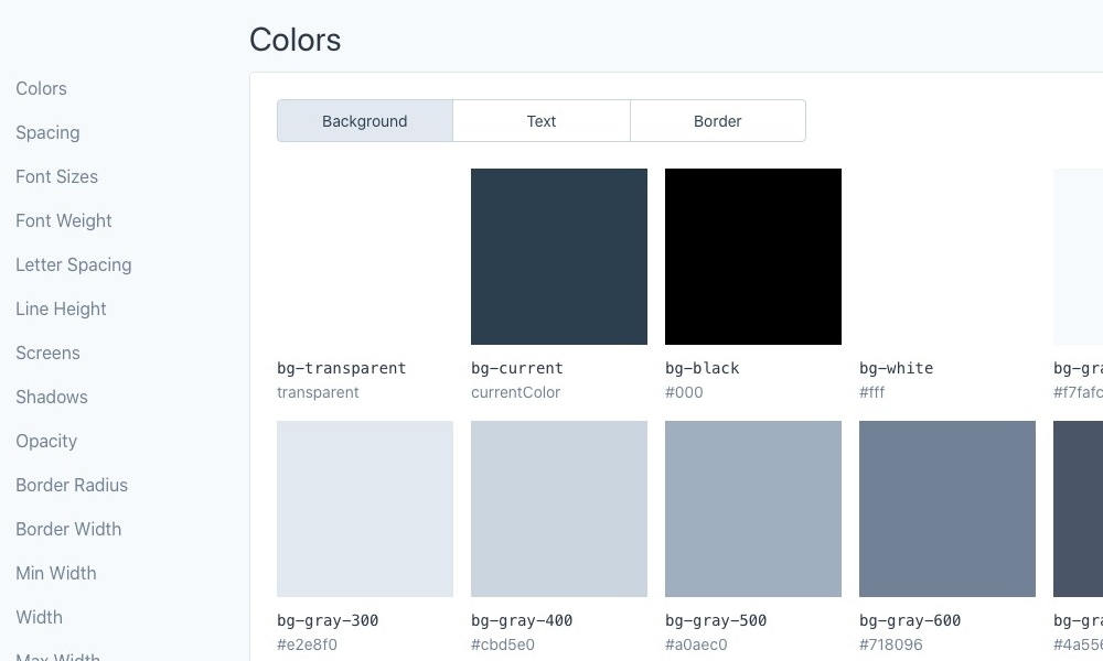
This is where tailwind-config-viewer comes in. It’s a helpful NPM package that creates a visual style guide from your project’s tailwind.config.js file.
Instead of digging through the config file manually, you get a clean, searchable web interface that shows all your custom settings including the colors, spacing, typography, and breakpoints, right in your browser.
To get started, you can run the following to install it:
npm i tailwind-config-viewer -D
Then, add a custom script in your package.json file.
"scripts": {
  "tailwind-config-viewer": "tailwind-config-viewer -o"
}
Now, you can run npm run tailwind-config-viewer, and it will launch a local server displaying your Tailwind CSS configuration in a user-friendly format, as seen below:
Wrapping Up
Tailwind CSS is a powerful framework, but managing its utility-first approach can get overwhelming as projects grow. The tools we’ve explored in this article can significantly boost your productivity by simplifying class management, improving code quality, and enhancing your workflow.
We hope that these tools help you work more efficiently with Tailwind CSS and make your development process smoother and more enjoyable.