How to Style React Aria Components with TailwindCSS
React Aria Components (RAC) is a library from Adobe that gives you fully accessible, production-ready React components—but without any default styling. This makes RAC perfect for pairing with a styling framework like TailwindCSS, since you can design everything exactly the way you want without fighting against preset styles.
I’ve been using RAC in various projects, and one thing that I like about RAC is how it handles the component states. Instead of just using CSS pseudo-classes like :hover or :active which don’t always behave consistently on touch devices or with keyboards, it uses data- attributes like data-hovered, data-pressed, and data-selected.
Using with TailwindCSS
TailwindCSS is one of my favourite ways to style components. While React Aria Components work just well with TailwindCSS, there’s a catch when it comes to styling component states. Because RAC uses data attributes, you can’t just use Tailwind’s usual hover: or focus: variants. Instead, you need to write out the full attribute using Tailwind’s arbitrary variant syntax, for example:
<Button className="data-[focused-visible]:bg-blue-400 data-[disabled]:bg-gray-100" />
This works fine but it can be redundant. The class names can quickly get long and messy, which makes our code harder to read and scan. We also lose out on Tailwind’s handy editor autocompletion, so typos become more likely.
This is exactly the problem that the tailwindcss-react-aria-components plugin is built to solve. Let’s see how it works.
Installation
Installing the plugin is simple. We can add it with NPM with this command below:
npm install tailwindcss-react-aria-components
Configuring the plugin will depend on the Tailwind version you’re using on the project.
On Tailwind v3, add it to your tailwind.config.js:
/** @type {import('tailwindcss').Config} */
module.exports = {
  //...
  plugins: [
    require('tailwindcss-react-aria-components')
  ],
}
On Tailwind v4, use the new @plugin directive in your main CSS file:
@import "tailwindcss";
@plugin "tailwindcss-react-aria-components";
Once installed, styling the component is more simplified. Verbose data attributes like data-[pressed]: turn into clean variants such as pressed:, and data-[selected]: becomes selected:. Even non-boolean states are shorter, for example data-orientation="vertical" now becomes orientation-vertical:.
Here’s a quick comparison of the two approaches for some of the states in RAC:
| RAC State | Tailwind Attribute Selector | Simplified Class Selector |
|---|---|---|
isHovered
|
data-[hovered]
|
hovered:
|
isPressed
|
data-[pressed]
|
pressed:
|
isSelected
|
data-[selected]
|
selected:
|
isDisabled
|
data-[disabled]
|
disabled:
|
isFocusVisible
|
data-[focus-visible]
|
focus-visible:
|
isPending
|
data-[pending]
|
pending:
|
Prefixing
By default, the plugin’s modifiers are unprefixed, so you can use variants like disabled: right away, for example:
import { Button } from 'react-aria-components';

function App() {
    return (
        <Button className="disabled:opacity-50" isDisabled>
            Submit
        </Button>
    );
}
But if you prefer a clearer naming convention, you can set a prefix in the config. This can be especially handy in larger projects where you want to avoid clashes with other plugins or custom utilities.
Again, the setup will depend on the Tailwind version you’re using.
On Tailwind v3, you can add the prefix option when requiring the plugin in tailwind.config.js:
// tailwind.config.js
/** @type {import('tailwindcss').Config} */
module.exports = {
  //...
  plugins: [
    require('tailwindcss-react-aria-components')({ prefix: 'rac' })
  ],
}
On Tailwind v4, you can pass the prefix option in the @plugin directive in your main CSS file, like below:
@import "tailwindcss";
@plugin "tailwindcss-react-aria-components" { prefix: hk };
Now, all the variants will be prefixed with rac-, so disabled: becomes rac-disabled:, and selected: becomes rac-selected:.
Here’s the same example as before, but with the prefix applied:
import { Button } from 'react-aria-components';

function App() {
    return (
        <Button className="hk-disabled:opacity-50" isDisabled>
            Submit
        </Button>
    );
}
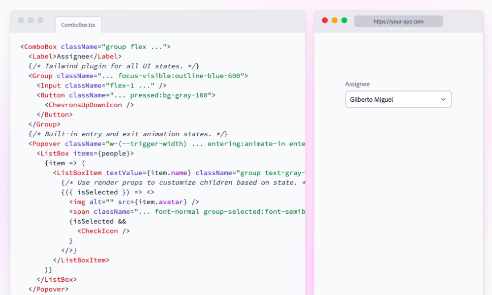
Here is a quick demo of the plugin in action.
Wrapping Up
Styling React Aria Components with TailwindCSS doesn’t have to be complicated. With the tailwindcss-react-aria-components plugin, you can skip the verbose syntax and work with clean, intuitive variants that feel just like native Tailwind utilities. This makes it much easier to keep your code readable, your workflow smooth, and your components accessible by default.
In this article, we focused on styling. But that’s just the beginning. In the next one, we’ll take things a step further and explore how to animate React Aria Components with TailwindCSS, adding smooth motion to make your UI feel even more polished and engaging.
Stay tuned!