Master Color Accuracy: Essential Guide to Monitor Calibration
The advances in technology in the field of photography have created more stunning, pure image quality and made picture processing and editing much easier. People can simply plug in their digital cameras to their computers, import the pictures saved as files, and reproduce them through printing.
However, this matter of convenience has a drawback that can prove to be troublesome for serious color photographers.
What you see on your digital camera’s screen won’t appear the same as when you transfer it to a computer and view it through your monitor. Similarly, what you see on your computer screen won’t be exactly what you’d get when you print it.
Although each device has color "language" that is mostly the same, there are important differences that set all of them apart when it comes down to the details.
Different Color Spaces
Computers break down colors into three primary ones, where all the other shades are derived from: red, green, and blue. Each one is given a corresponding number and is mixed together to produce all the different shades.
This is called the "color space".
The problem then lies in the fact that each device – the digital camera, the monitor, and the printer – has a slightly different color space that defines the shade of the numbers. This is more apparent in printers because instead of using red, green, and blue for producing colors, printers use cyan, magenta, and yellow.
Mixed Up Colors
A camera can have a combination of numbers that show cobalt blue, while a monitor shows sapphire and a printer produces Persian blue. The differences will even exist from one monitor to another.
It might not be readily apparent to the average person, but for professionals, having all three pictures show shades that look as similar as they can be is important. This is where one needs to practice "color management".
Color Management Standards
There is a standardized color management system introduced in 1993 by the International Color Consortium (ICC). It was created to make color production more consistent across all operating systems and software for display devices. Some manufacturers of such devices give out the ICC profiles of their products for customers looking to have a more exact display and print matches.

Monitor Calibration
To make sure each device will have a more similar color output, you will have to perform some calibration to get as close a match as possible. The simplest way to do this is to adjust the display settings of the monitor itself (contrast, balance, brightness, etc.).
If you have just turned your computer on, wait for 15 to 30 minutes before calibrating. The monitor might still be warming up, affecting its color output.
Brightness
Print a picture and compare it with the digital version so you can finetune the settings accordingly. Holding up the piece of paper right next to the monitor will not be enough, as brightness levels from the monitor itself may differ from the brightness level in the room.
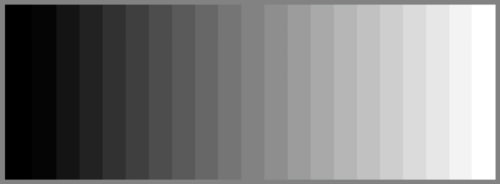
At lower brightness intensities, a picture with blue shades might look just right but under average brightness intensity, the same shade may appear more yellowish. You have to make sure that both pictures are seen at the same level. There is no use to compare a picture viewed under a fluorescent lamp and another viewed under direct sunlight.
Your workspace itself should have reasonably bright and uniform lighting. You will also have to take into consideration reflections from light sources on the monitor.
Color
Check the monitor’s display settings again for the dropdown "Colors" menu. Select the highest setting which is usually 32 bit or True Color for Windows and Millions for Macs – that is if it is not yet set to that level.
Monitors also need regular calibrating because they constantly change color values. Do this two to four times a month to make sure its color settings are as close to the print outputs as possible.
This kind of monitor calibration can be enough for some people who only need to make small adjustments.
Software/Hardware Calibration
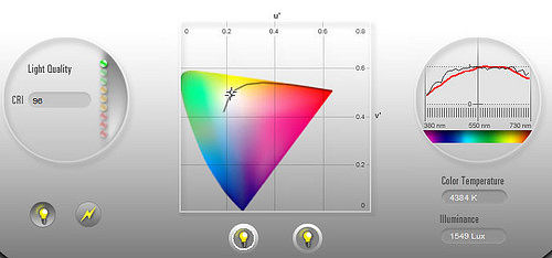
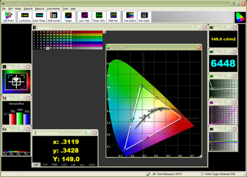
For more advanced calibrations, you will have to look for certain software and/or hardware that do the job. The programs do not just modify the brightness and color settings. They also modify the white point, which affects the "color temperature"; gamma, which affects the contrast of shades; and luminance, which affects the light emitted from the monitor.
This is different from the brightness in that it is more apparent through the brightness level of the actual environment surrounding the monitor.
There are some that only calibrate monitors, while there are others that also calibrate printers and digital cameras. For even more precise color matching, colorimeters for monitor color readouts and ICC profile detection, as well as special viewing lights for printed pictures are a must. However, these can be very expensive.
Wrap Up
While calibrating your monitor still cannot guarantee 100% identical print matches, it pays to make use of the resources and procedures available to get as close to perfect matching as possible. If you have questions about color management, share them in the comments area below.