Data Visualization with CSS: Graphs, Charts and More
A good data presentation is an important aspect of the web industry because it is the key to letting visitors understand your content within seconds. The easier or faster your visitors get a grasp of your web content, the higher it reflects your professionalism in handling presentation.
The criteria for a decent data presentation should be simple yet descriptive, well-elaborated but manage to maintain a user’s interest, takes no sweat to digest its content, convenient to compare, and lastly, the user should be able to make decisions or conclude the data presented effortlessly. As hard as these insane criteria may sound, it is possible.
In today’s post, we want to take you for a ride on various approaches to beautiful and creative data visualization tools that are entirely based on CSS/HTML. Yes , just copy and paste, then customize it according to your preference. These charts can be CSS bar graphs which display data in horizontal/vertical form and even Line graphs and Pie charts!
You want more? Keep scrolling!
9 Javascript Libraries For Interactive Charts
So you have in your hand tons of data, with a number of variables, that you have to... Read more
Horizontal Barchart
A simple way of displaying the statistical figure as an overview with this accessible bar chart using CSS. The bar calculates value cells and labels used. The table headers used using aural text class

CSSplay
Bar charts are a definitive list with styles and classes defined in each line. The first chart has an error that occurs when the values get closer to 100%, which is rectified in the second chart. Source code included for your reference.

Percentage Bargraph
Using the percentage width abilities of CSS, a percentage-based bar graph is created in this tutorial. In a horizontal bar graph, you can either set a marker to travel the length from left to right or produce a vertical graph by using the same technique and reproducing it multiple times

Maxdesign
Russ Weakley teaches you to create a graph based on percentage and using background images. Code and images linked can be copied and downloaded to use in your project.

Vertical barchart
Create vertical bar graphs using CSS and PHP by creating a simple list with height in pixels of the individual bar, the y-axis of the bar group, and class to style the data sets. Eric Meyer teaches you to turn the same into a bar graph, line graph, pointed graph, and a 3D graph using the same techniques

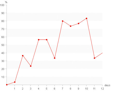
Pure CSS Linegraph
Line graphs deliver information much faster than tables with numbers. Learn to create a line graph with CSS using HTML, replace the text with images, and use CSS sprites and absolute positioning to obtain a line graph.
Simple Linegraph
A much simple line graph that uses only DHTML and CSS and where you can set a transparent background for the graph. This graph loads faster and blends with rest of the page.

Mgraph
This Ajax graph is used to represent data of a year according to each month using only CSS and XHTML and runs in Firefox and Opera

Multicolumn lists
Paul Novitski teaches you to create a multi-column list using CSS in this article. He discusses a lot of techniques like floating the split lists, numbering them with HTML attributes, CSS generated content, wrapping the list with XHTML, CSS, etc and finally adds a little styling and background image to achieve the multi-column list perfectly.
Bulletgraph
A bullet graph compares a single measure to one or more other measures and displays the qualitative range of performances. They are quite flexible for data-driven sites. Learn to create a bullet graph using CSS / HTML.

Downtime graph
Downtime graph initially had a problem displaying long time intervals on limited screen area and keeping a transparent layout of events which was clarified by the monthly calendar paradigm.
The onMouseOver() is kept running and different colors are used for different types of downtime events.

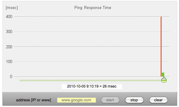
Dynamic live CSS graph
A live dynamic CSS graph to display the response time of ping executed by a web server reads the data from a web server with CSS and JavaScript code, AJAX functions, and graph sliding.
Production plan graph
A Production plan graph is created using the graph class as graph container and hLine also vLine for separator lines drawing. This graph is used in intranet applications.
The width of the graph is calculated according to the displayed number of days and height using the number of job changes.

Sandwich graph
A sandwich graph is created when a single bar in a bar graph is split into many layers where height of a single column may indicate a global trend, whereas the height of a single layer indicates a portion of this layer. Create a CSS sandwich graph from this tutorial.

Stacked bargraph
For a stacked graph, a definition list is used to present data, then the margins and padding are reset to appear the same in all browsers. Axes are added and stylized to get the stacked bars. Each and every detail is precisely taught in this tutorial.

Vertical Bar Graph

A vertical bar graph is used to show a hypothetical set of data. Here the bar graph is about a simple table and few div’s. The calculation of the height of the bars and the horizontal strata can be done in PHP, ASP or in server side processing engine or through javascript on the client side.
Piegraph
Pie charts make it quite easy to understand because they can be used in many colors which easily differentiate them with others and don’t require much space in the same time. A tutorial to create a simple Pie chart using DHTML / CSS. Insert the script for the Pie chart on your page

Plotkit Piechart
Plotkit is well structured, a rewrite of CanvasGraph used for plotting graphs and charts for Javascript. It supports HTML Canvas i.e. Safari, Opera, Firefox and IE and SVG through Adobe SVG viewer.

Other CSS Visualisation tools
Visual CSS Maps
This tutorial makes the maps more accessible, useful, and visually attractive using CSS. These maps start by organizing with data and then creating a map using that data by adding some styles, displaying data as a tooltip, turning off the javascript and finally, an interactive map is created.

Animated Progress bar
An animated progress bar is created using CSS with 3 elements, 1 container and 2 nested elements and the animation is done using an animated gif. A background image is used in the container with defined height and width.

CSS Timeline
Using CSS and unordered lists a CSS timeline can be created for the ‘About’ Section with simple markup. A nice-looking timeline styled using CSS is created which will work even if the visitor does not have his CSS enabled.

Slickmap
SlickMap CSS is a style sheet that displays the finished site maps from the HTML unordered list navigation. It can be customized to your own needs or styles. SlickMap streamlines the design process and eliminates the need of additional software by automating the illustration of site maps

Scrollable CSS Table
A table need not always be fixed in data. We can create a scrollable table with a fixed header and any number of data that can be scrolled.

Did we miss out any tools which you found useful? Do let us know and share it with us.