A Nostalgic Journey: Evolution of Popular Websites Over Time
As the digital landscape constantly evolves, so do the designs of popular websites. Whether for better or worse, these changes reflect the ever-shifting trends in interface design. In this article, we’ll take a nostalgic journey to explore how some of your favorite websites have transformed over the years.
By delving into the past, we gain valuable insights into what worked and why. After all, history often serves as our best mentor.
Websites We Visit: How They Look Like 10 Years Ago
Most of us probably got our Internet connection somewhere 10 years back. It was also around that time... Read more
The Evolution of YouTube
YouTube needs no introduction; it’s the leading platform for sharing videos and handles an enormous amount of data. Launched in 2005, the platform has seen significant growth and multiple design changes.
What stands out about YouTube’s design journey is its focus on user-friendly interfaces. The current design, integrated with Google accounts, has come a long way but still maintains its core principle of simplicity.
Snapshot from October 2006
Let’s rewind to Autumn 2006, shortly after YouTube’s debut. The design had already undergone some refinements since its initial 2005 launch. The top tabs made navigation a breeze, and the featured stream showcased trending videos.
This update was particularly noteworthy as it encouraged users to explore channels more actively.

Update from September 2007
Fast forward to 2007, and we see YouTube experimenting with various homepage widgets. These were Flash-based, as were many of the video players at the time. The design also made it easier to skim through video listings.
Key details like the uploader, star rating, view count, and video category were all neatly displayed. The design elements, such as glossy blue gradients, added aesthetic appeal without compromising usability.

Redesign in April 2012
YouTube maintained its core layout with minor tweaks until early 2012. Then came a significant redesign that darkened the background and introduced a new column for category links.
The current design still echoes this 2012 update. While minimalism remains a key feature, the design now incorporates more than just empty space.

10 Basic Youtube Tips You Should Know
Have you ever thought that there might be more to YouTube than just hitting the play button? Beyond... Read more
The Transformation of Digg
Long before I fully grasped the intricacies of the Internet, Digg was my go-to source for news and entertainment. Founded by Kevin Rose in November 2004, Digg has seen its share of ups and downs, culminating in its acquisition by Betaworks in July 2012.
Let’s take a look at how Digg’s design has evolved over the years, capturing the essence of its time while also adapting to new trends.
Design from February 2006
One of Digg’s earliest designs featured a simple blue top bar for navigation, accompanied by standard website links. The voting badges were rudimentary, appearing in a blocky yellow design. The sidebar felt a bit cluttered, housing categories and related links.
Despite its simplicity, this design was effective in attracting an initial user base and setting the stage for Digg’s rapid growth.

Snapshot from October 2008
Fast forward to October 2008, and we see a Digg layout that many users fondly remember. This version introduced several social networking features and improved the overall user experience. Story submissions now included thumbnails, and the categories were more accessible via dropdown links in the header.
The user profiles were highly customizable, and the feature known as “shouts” allowed users to share favorite stories with friends. Digg was truly a trailblazer in the realm of social news.

Update from October 2011
The October 2011 update was met with mixed reviews. The community’s influence was now determined by follower count, a departure from the previous power user system. This change, along with the Digg v4 launch, resulted in broken links and lost features, causing disappointment among users.
While the design itself was minimalistic and visually pleasing, it felt like a step back in terms of functionality. For a different startup or social news platform, however, this design could serve as an excellent starting point.

The Evolution of WordPress
WordPress stands as the most popular open-source blogging platform, revolutionizing the way we write and share content online. With just a bit of investment in web hosting, anyone can set up a WordPress site in less than an hour.
Automattic, the parent company, has been consistently adding new features and scaling the platform year after year.
Snapshot from August 2005
The initial design of WordPress was quite basic, lacking any flashy logos or vibrant colors. This screenshot from August 2005 shows a simple layout with a white background.
As an open-source project, WordPress started with humble beginnings. It’s fascinating to see how much the platform has evolved over the years.

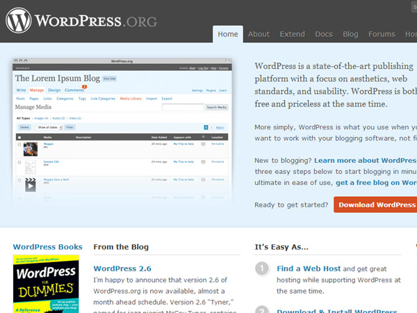
Design from August 2008
This screenshot from August 2008 shows a design that closely resembles the current WordPress website. The top navigation includes links to free themes, plugins, and official documentation.
The design features a dark header area contrasted by a bright blue mid-section, elements that have been retained in subsequent updates.
The Journey of eHow
eHow serves as a reliable source for tutorials and how-to guides, offering content since the early 2000s. Managed by Demand Media, the current design resembles a typical online magazine but with easy-to-follow tutorial formatting.
Snapshot from August 2004
The eHow design from August 2004 was simple and clean, albeit a bit small. The layout featured straightforward category listings and side tabs for related navigation items.
Though basic, the design was effective and remained in place for several years before transitioning to a more modern look.

Design from August 2008
The 2008 iteration of eHow featured an eye-catching header and a layout that resembled a tutorial publication rather than a basic directory. The homepage utilized widgets for featured FAQs and other content.
The sidebar included vertical navigation for major categories, a common feature in FAQ websites. This version also encouraged more user interaction, with top tabs linking to profiles and pages for creating your own tutorials.

The Transformation of Delicious
Delicious made its debut in 2003 with the unique URL del.icio.us, a trend many web 2.0 platforms followed. However, after its acquisition by Yahoo! in 2005, the site shifted to the more conventional delicious.com.
Design from August 2006
The layout from August 2006 was quite straightforward, featuring a “hotlist” section on the homepage that displayed popular bookmarks and their associated tags. Interestingly, a registration form was prominently placed on the homepage, aiming to attract more users.

Design from August 2008
Fast forward to August 2008, and we see a much-improved layout. The tag interface was particularly user-friendly, featuring clickable tags that displayed bookmarks from other users. This version remains my personal favorite and serves as a great example for other social bookmarking platforms.

The Evolution of Flickr
Just as YouTube revolutionized video sharing, Flickr was a trailblazer in the realm of photo uploading. The platform offered a plethora of features, including tagging, geolocation, and album creation. Despite a significant redesign in 2013, Flickr remains the beloved photo-sharing platform we all know.
Design from August 2005
The initial Flickr layout was basic but functional. However, it lacked clear explanations about the platform’s purpose. Despite this, users could easily log in, register, and navigate through photos and tags.

Design from August 2008
By August 2008, Flickr had undergone several improvements. The design was cleaner, the typography was more readable, and the overall layout was more inviting. This style remained Flickr’s homepage for a long time and is fondly remembered by long-time users.

Concluding Thoughts
These examples offer valuable insights into the evolution of web design. The Wayback Machine serves as an invaluable resource for archiving website layouts for future study and a nostalgic trip down Internet memory lane.
Web design has come a long way since the early 2000s, and it’s exciting to think about what the future holds.