30 Beautiful Three-Colors Websites For Your Inspiration
Color affects a design greatly. However, a design with too many colors can easily overwhelm a viewer. Sometimes a minimalist approach can help draw the eye of the visitor to specific content – the right content.
In this collection of websites, we focused on designs that used three colors for their primary design elements. However, a few of these sites do include one or two highlight colors beyond the 3 main colors. Nonetheless, these websites were just too well-done and close enough to the 3 color criteria that we could not help but include them in this collection.
Notice how the colors help you focus your attention to where it is needed. Can you see how the brand was tied into each of these designs? You can also see how using full-color graphics alongside a limited color palette is still useful without going too far down the minimalist design path. The following examples will show you that websites that use a maximum of 3 colors can still be effective.
Recommended Reading: Beautiful & Creative Single-Page Portfolio Websites
Image Mechanics
A nice minimalist design, that uses just enough color to draw the eye to important content on the site.

nclud
The large, blue photographic background is a nice contrast to the white main text and green brand name, which draws a reader’s attention first. The light blue text draws the eye downward to a brief description of the company and a list of their impressive clients. Nice use of color to create hierarchy!

The Loft
Different shades of grey on a white background give this web page a sophisticated minimalist appearance. The colored text in the page menu act as a guide in navigating the site.

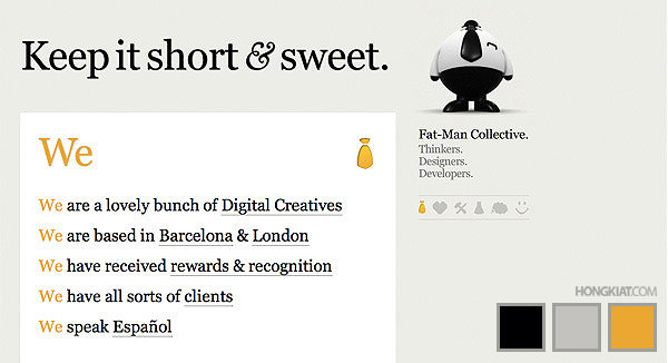
Fat-Man-Collective
Just like their branding look and tone, this website design is also "short and sweet." Way to go with maintaining a branded look!
Creative Spark
Minus the illustration, this website incorporates only 3 colors into its design: yellow, black, and white, which is a nice reference to a light bulb, when you think about it. And a lightbulb works well with the company name, Creative Spark. Interesting.

Pepperminted
Cute name and a cute mostly 3 color design, this one is simple yet creative at the same time.

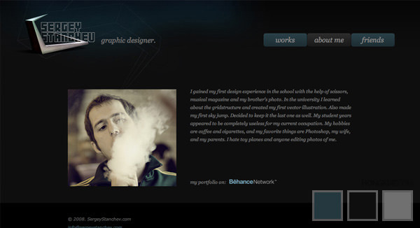
Sergey Stanchev
The dark color scheme and limited use of color give this site a sophisticated, professional look and feel.
Digimurai
The text colors of orange and blue coordinate with the illustrated background and cute little mascot.

Causecast
Grey, blue, and pink on a white background provide a very "happy" tone, which seems like a good choice for a volunteering/charity program.

Astheria
This clever design uses colors of, well, drugs! White, grey, and blue are usually the colors you see on pill boxes, so these designers really ran with the idea of "Design is a drug."

Dave Airey
Ah, David Airey, one of the most popular brand identity designers in the graphic design blogging community. His site is minimalist featuring only black, orange and grey text on a white background. Simple yet effective!

Eduardo de La Rocque
The textured background looks like the fancy paper some people use for resume and CV printing. It is interesting, too, that the pinkish-red text fades to light grey when you hover your mouse over it.

Eight Face
Black, white, and grey, along with a few hints of orange text, are the main colors used in this design. These colors give this website a sort of "news" appearance.

Fever
Dark and light grey and red are used interchangeably in this design. While this design could be a bit more well organized in terms of what colors were used where, they did stick with the three colors of the title very well.

Stefan Coisson
This site uses 3 colors quite effectively in a simple website layout. While the text could be better organized, the green highlight stands out nicely against the black and white text.

Jon Tangerine
Okay, so this is another that stretches beyond the 3 color scheme a bit, but it is such a beautiful site that it screams, "Look at me!" The yellow highlights and text links (with a little bit of orange underlining) contrasts nicely with the black and grey and occasional white text. Beautiful!

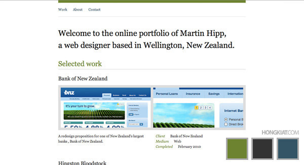
Martin Hipp
Dark grey, black, and a grass green blend well to give this site a refreshing professional yet unique appearance.
Minimal Sites
Starting to notice a pattern in the use of black, grey, and a bright color on a white background? Maybe this type of color scheme is popular because it creates a minimalist look with just enough color to draw attention… and this website is no exception.

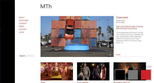
Motion Theory
The strip of black on the side is a nice touch that adds to the "film" look and feel. Grey and red text keep this site simple, which is very important with all of the images that must be included.
A way back
Blue along with shades of grey keep this design minimalist and traditional. The 3 different colors are used nicely to draw attention to important text.

Grain and Gram
This website does a great job of creating a "gentleman’s" appeal with manly colors of dark grey, a grain color (in keeping with the title), and white.

Awesome Font Stacks
Orange along with black and grey (and a tiny bit of white text) helps to break up this text-heavy site and make it interesting.

Yuna
This site mostly uses the dark and light greys of the geometric shapes, but blue is also a highlighting color, along with a bit of pink. So, really, this is another variation of the black, grey, and highlight color scheme.

Pentagon
Grey, some white, and lots of blue make for a very simple color scheme. On the other hand, the blue seems a bit overwhelming, and the flashing graphics don’t help much.

Graphic Design on the radio
Technically, this site only uses about 3 colors: black and grey text in white boxes, and the pink textured background. But, wait! Close the page, reopen it, and the background is now blue, no, yellow. Okay, you can quit reopening the page, now. Disappointed there’re are only three colors to play with, aren’t you?

Pixelbot
Again, Dark grey, light grey, and a highlight color make for a simple, effective color scheme for web design.
Site inspire
While having the text change color when you hover the mouse over it can be fun, this one may take advantage of this feature a little too much. But maybe they can get away with it because of their simple, 3-color design.

Stefan Persson
Grey/black with orange and white add to this very well-organized design. Each color seems to stick to a strict use, which really takes navigation of this site to great heights.
Faust
A simple color scheme helps to tone down the busy-ness of this site; however, less orange would have helped the design even more.

Industrial Facility
The navigation of this site is a bit different, something not always recommended. Yet the dark grey, light grey, and white color scheme helps keep the site simple enough to learn fairly quickly.
