How to Plan Content Arrangement For Responsive Design
In a recent post, I discussed how visual content relates to layout design. However, this subject is very detailed and splinters off into many sub-topics, one of which is visual organization for responsive layouts.
In this post, I’d like to delve deeper into responsive content to look at some best practices for rearranging content for smaller screens. In UI & UX design, there is no single right answer for every project, but there are trends that work well, and from these trends, you can build your own ideas.
Rearrange Grids To Lists
Every website uses some type of grid whether it’s visible or not. Content in a solid grid often groups horizontally on wider monitors, but this doesn’t make sense on smaller devices. The best remedy is to break down these grids on smaller screens and convert the items into lists.
Read Also: What You Need to Know About Visual Content Direction
Example 1: Wellington City Council
Take a look at the website of the Wellington City Council which uses a number of grid-styled sections on the home page.
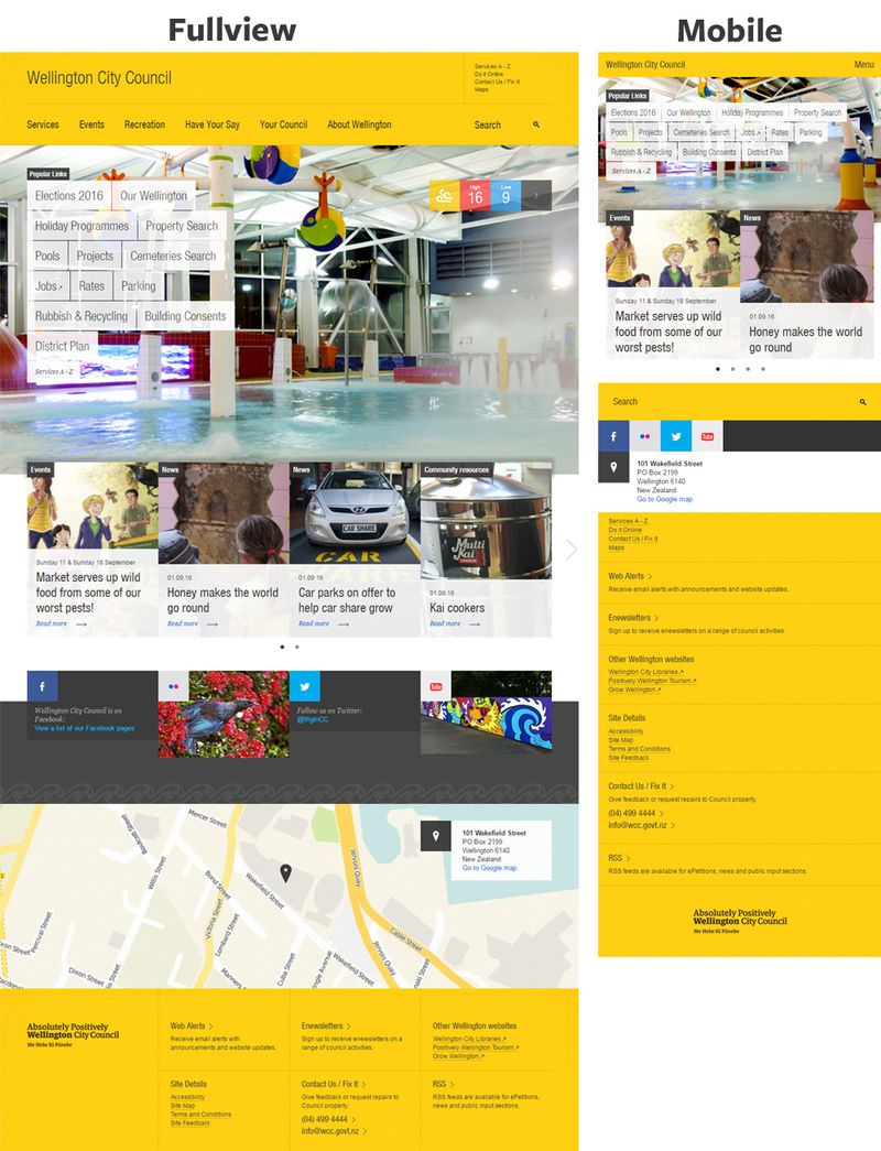
There’s a small slideshow of square links that reduces as the browser window resizes. The footer section also becomes smaller, and eventually converts into a vertical list of links.
On very small phones with 320px width, you need to design for the device size. In the case of an iPhone, the device is taller than wider, so it makes sense to arrange content that way.
Example 2: Mooyah Burgers
Take a look at the home page for Mooyah, and try resizing the layout. There’s a small slideshow area that contains three items on a desktop screen, but this shrinks down to show only one item on mobile (adding more hidden slides to the widget).
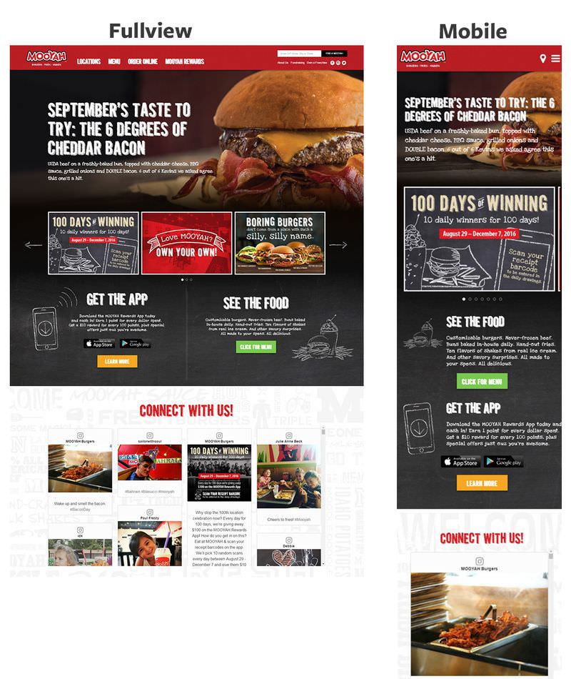
The two promotional boxes advertising the Mooyah app & menu stay fixed side-by-side until the screen gets small enough to rearrange them vertically.
The “Connect with us!” section also rearranges content so that each social post gets as much room as possible. Generally speaking, widescreen monitors are the widest, and smartphone screens are the tallest.
Example 3: Theme Market
When designing a layout with a grid, you should consider both wide & tall layout styles before writing a single line of code. This way, you’ll be prepared to build breakpoints that make sense.
A page with a full grid layout should reduce the size of boxes before breaking them onto a new line. For example, Theme Market has a fixed max width of 1240, and the grid contains four blocks per row.
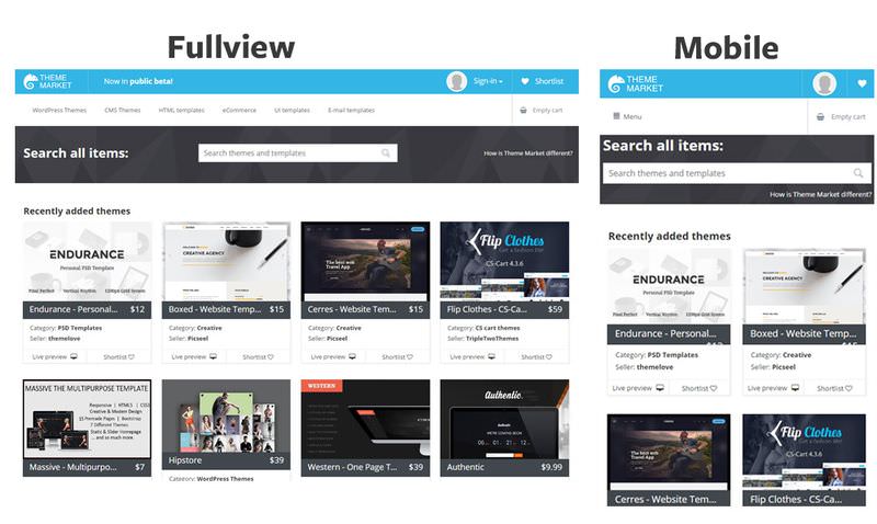
As the screen gets smaller these blocks reduce in width, but eventually break down to leave three boxes per row. At the smallest size, you get one box per row, and it has plenty of room for text & imagery to shine.
There’s always a balance of keeping as much info in view as possible combined with the need to make text readable. The more you build grid layouts, the easier it’ll be to find this balance of content arrangement.
Hide or Remove Columns
Wider monitors and more browser support allow developers to build incredibly complex layouts. I often see blogs with three or even four columns that take up a good portion of the screen.
However smaller devices need a content flow that makes sense vertically. I’ve found two options for handling excessive sidebars:
- Drop them beneath the main content
- Hide them altogether
Example 1: Stop Press
Take a look at the Stop Press website. It has four vertical columns on my desktop monitor.
The left column is a vertical nav menu, the next column is the main content column with recent articles. Then we have two different sidebar columns overflowing with extra “aside” content.
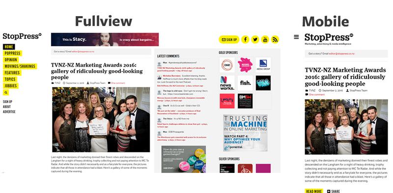
As the browser window resizes, these columns slowly reduce in size. The first to go is the left navigation which gets hidden behind a hamburger menu icon.
The next breakpoint hides the middle column along with the top social sharing buttons. Then finally, on the smallest screens, the far right sidebar completely disappears , leaving just the primary center column of content.
None of the sidebar content appears beneath the main content. It’s completely hidden from view, and this is a perfectly acceptable choice to reduce page load and to keep the scrollbar height at a decent size.
On the other hand, many blogs do move the sidebar beneath the main content like on Concept Art Empire which features related posts in the sidebar that eventually drop below the content.
Example 2: Wishpond Blog
The Wishpond Blog also completely removes the sidebar from the screen on smaller viewports. This sidebar area typically contains advertising, signup forms, and related post links. None of this content is vital but it can add value to visitors.
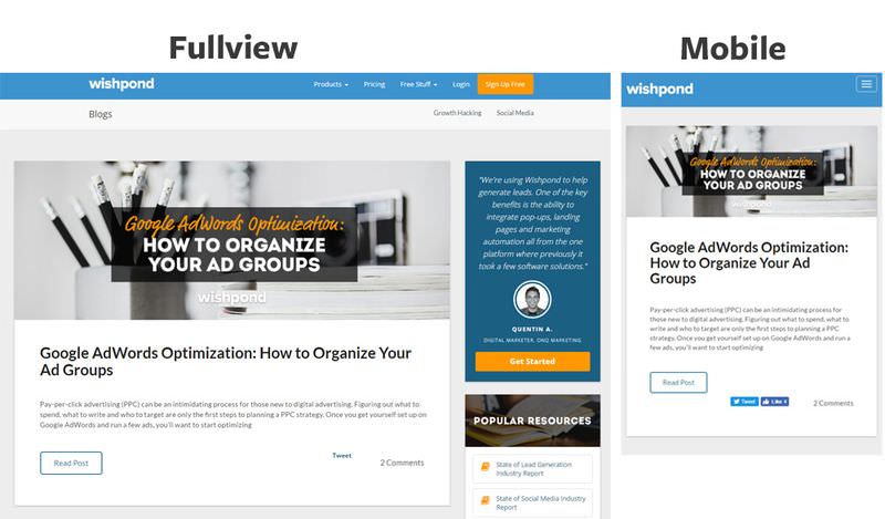
I like to follow a hybrid approach where I move the sidebar beneath the content but also hide a few items in the sidebar past a certain breakpoint.
For example, if I have three ad blocks in the full layout, I may hide two of those ad spaces on mobile. This makes the sidebar content accessible but doesn’t clutter up the page with excessive content.
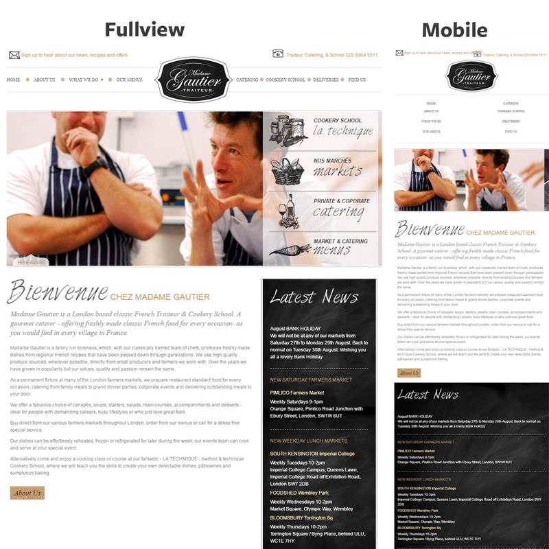
Example 3: Madame Gautier
I also like how Madame Gautier uses their “Latest news” sidebar on the home page. It eventually drops below the content, and takes up a full view position on the page.
Almost every website will have at least one sidebar in the design. Whether this is a site-wide sidebar or just something that appears on a page template, the side-by-side design style is popular because it fits more content on the screen.
It’s your choice how to handle the content. You can drop the sidebar lower, hide it altogether, or use a hybrid of these two techniques. But you should make your choice based on the relevance of the sidebar, and its necessity to the page.
Adjust & Squeeze Margins
There will always be a point where content cannot be squeezed any further, and one section needs to drop below the other.
By adjusting margins before lowering content on the page, you give readers a wider breadth of content to choose.
Example 1: One World
The footer on One World is a great example. It has sitewide footer links floated right with an email signup form on the left.
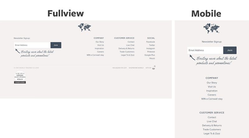
As the layout resizes, the margins and paddings between these elements shrink. The link columns get closer together, and the signup form gets a little smaller, too.
Past a certain point, it just makes sense to drop the links beneath the signup form, and give the footer plenty of room to breathe.
Yes, it does make the page longer, and yes, it takes more effort to scroll down that far, but at these smaller breakpoints, you can assume users are on vertically oriented devices.
Example 2: Golden Isles
Another example I love is the Golden Isles home page with its unique navigation style. When you resize the browser window the nav links squeeze together. Eventually, they break from a single line into two rows, then down into columns at the very smallest size.
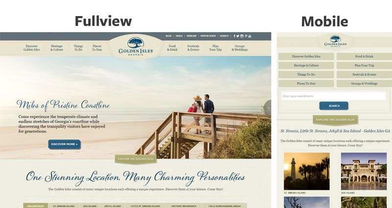
Other items on the page follow the same pattern. This example demonstrates the power of resizing margins before completely rearranging the layout.
Vertical Flow On Smaller Screens
Page content should flow naturally, and vertical alignment makes sense on mobile. This means you need to consider in-page content blocks to update the content style accordingly. This includes paragraphs, headers, blockquotes, unordered lists, and also custom content boxes.
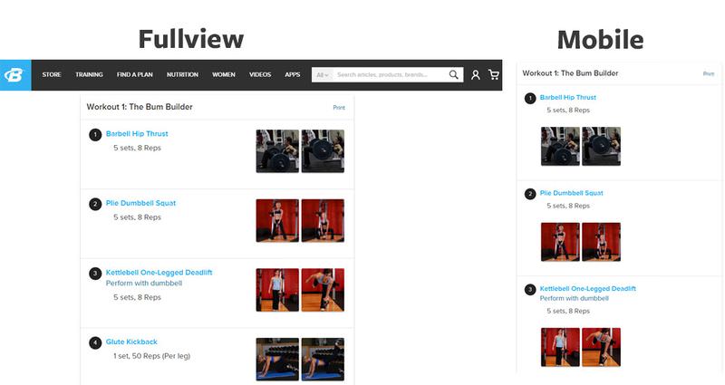
Example 1: BodyBuilding.com Single Post
Take for example this BodyBuilding post which uses small boxes to show off different glute workouts.
These boxes include thumbnails on the right side to demonstrate the exercise. On smaller screens, these thumbnails break down onto a new line, and eventually stack on top of each other.
Your responsive CSS should consider this tiny minutia for every page of the website.
Example 2: Vanity Fair
For a bigger example, check out the Vanity Fair home page which completely rearranges the featured story slider. On a fullscreen desktop, the stories list headlines with one featured image showing to the side. As the browser resizes smaller, this top stories section becomes a sliding carousel.
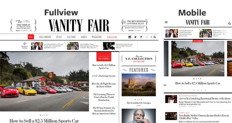
The interface itself completely changes by adding dot navigation, arrows, and featured images for each story in the list. Their fullscreen list of articles is more “vertical”, but this layout is trickier to operate on a mobile screen, so changing it into a sliding carousel is a better option.
Think more about the user’s flow rather than your content flow. Content doesn’t always need to be forced into a vertical layout on small screen. Just think about how to organize content in a way that supports a vertical browsing experience.
Closing Thoughts
Responsive design is essential these days, and every web designer and developer should understand how it works. Visitors expect all websites to be mobile-friendly. Whenever I stumble onto a non-responsive website, I cringe at the sight of that horizontal scrollbar.
Follow the tips in this post for planning design strategies to rearrange content for the best possible user experience on all devices.