Building a Mobile Panel with jQuery Mobile
In terms of screen size, mobile devices have smaller screens than a PC monitor. When viewing webpages or apps, there are some elements that are translated to accommodate this screen limit. Commonly, there is a button at the right or left, which will reveal hidden elements when it is tapped.
Take the Facebook app for iOS as an example; if you tap the icon on the left side, it reveals the link menus to navigate the app, while if you tap the icon on the right side, it will reveal your online contacts. Most of today’s apps apply a similar approach.
In our previous post, Jake has shown you how to build this kind of function from scratch using jQuery. Today, we will explore another way of using jQuery Mobile.
jQuery Mobile is a framework that is specifically designed to build user interface and interaction for mobile devices – like iOS, Android, Windows Phone, Blackberry and Symbian. In the context of our discussion, it provides a component called Panel Slide to build that function in a much easier way.
40+ Resources and Freebies For Mobile Web App Design
The advancements of smartphones have improved the quality of mobile web development. It is now possible to generate... Read more
Requirement
First, you need to download jQuery, jQuery Mobile Library, and jQuery Mobile Stylesheet. Then link them to your HTML document, like so.
 <link rel="stylesheet" href="http://code.jquery.com/mobile/1.3.0-beta.1/jquery.mobile-1.3.0-beta.1.min.css" />
 <script src="//ajax.googleapis.com/ajax/libs/jquery/1.9.1/jquery.min.js"></script>
 <script src="http://code.jquery.com/mobile/1.3.0-beta.1/jquery.mobile-1.3.0-beta.1.min.js"></script>
HTML Markup
Depending on the App you build, Panel can be anything. In this example, I will just follow Facebook to make it easy.
In this post I will be creating two panels, left and right. The left panel is for placing the app menu navigation, and the left one is for listing the people that are currently online.
Our demo page consist of four sections, the header, the content and two panels. In jQuery Mobile, these sections are defined using HTML5 data-role attributes, as follows.
<div data-role="page">
<div class="header" data-role="header">
<span class="open left"><a href="#panel-01"></a></span>
<span class="title">Hello World</span>
<span class="open right"><a href="#panel-02">☰</a></span>
</div>
<div class="content" data-role="content">
<h3>This is the content</h3>
<p>Lorem ipsum dolor sit amet, consectetur adipisicing elit, sed do eiusmod
tempor incididunt ut labore et dolore magna aliqua. Ut enim ad minim veniam [...].</p>
</div>
<div class="panel left" data-role="panel" data-position="left" data-display="push" id="panel-01">
<ul>
<li class="newsfeed"><a href="#" title="Home">News Feed</a></li>
<li class="profile"><a href="#" title="Profile">Profile</a></li>
<li class="setting"><a href="#" title="Setting">Setting</a></li>
<li class="logout"><a href="#" title="Logout">Logout</a></li>
<li class="report"><a href="#" title="Report">Report Bug</a></li>
</ul>
</div>
<div class="panel right" data-role="panel" data-position="right" data-display="overlay" id="panel-02">
<ul>
<li><a href="#" title="John Doe"><span class="avatar"><img src="img/mambows_120.jpg" width="30" height="30"></span>John Doe</a></li>
<li><a href="#" title="Jessy Doe"><span class="avatar"><img src="img/mkalalang_120.jpg" width="30" height="30"></span>Jessy Doe</a></li>
</ul>
</div>
</div>
jQuery Mobile provides three methods to show the panel namely reveal, push, and overlay; these methods are specified with data-display attribute.
reveal will show the panel by sliding the content page. It is the default method applied if the attribute is not specified explicitly. The push method will display the panel by sliding both the panel and the content at the same time, while the overlay method will show the panel at the top of the page content.
CSS and Theme
As we have linked the jQuery Mobile stylesheet, our page has also been styled up without the need of additional style rules.
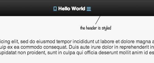
You can apply the themes that are provided using data-theme attribute. But, in this example, we will just leave the header style as shown in the above screenshot, then style the page and the panels on our own. Here are our style rules.
 .open a, .open a:hover {
  padding: 7px 15px;
  background-color: #000;
  border-radius: 3px;
}
.open {
  color: #fff;
  position: absolute;
}
.open.left {
  left: 20px;
  cursor: pointer;
}
.open.right {
  right: 20px;
  cursor: pointer;
}
.panel {
  background: #7F8C8D;
  color: #ECF0F1;
}
.panel a {
  color: #FFF !important;
  text-shadow: 0 0 0 rgba(0,0,0,0);
  font-size: 14px;
  padding: 15px 20px 15px 60px;
  display: block;
  text-decoration: none;
  border-bottom: 1px solid #475657;
  border-top: 1px solid #95A5A6;
  position: relative;
  font-weight: 400;
}
.panel ul {
  padding: 0;
  margin: 0;
  list-style: none;
  border-bottom: 1px solid #95A5A6;
}
.panel .avatar {
  position: absolute;
  top: 8px;
  left: 20px;
}
.ui-panel-inner {
  padding: 0;
}
.panel a:hover {
  background-color: #95A5A6;
}
.panel.right a:before {
  content: '';
  display: block;
  width: 12px;
  height: 12px;
  border-radius: 50%;
  position: absolute;
  background-color: #2ECC71;
  right: 20px;
}
.panel.left a:before {
  content: '';
  display: inline-block;
  position: absolute;
  width: 24px;
  height: 24px;
  top: 15px;
  left: 20px;
  font-family: 'hk-demo';
  text-align: center;
  font-size: 18px;
}
.panel.left .newsfeed a:before {
  content: '\f09e';
}
.panel.left .profile a:before {
  content: '';
}
.panel.left .setting a:before {
  content: '\2699';
}
.panel.left .logout a:before {
  content: '\e78e';
}
.panel.left .report a:before {
  content: '\f0e0';
}
I will not slice how these styles work bit per bit, as we already discussed this in our previous posts – such as Pseudo-elements and Font Icons.
That’s all we need. We don’t need to add extra pieces of JavaScript as it all has been handled by the framework, and the panel is now workable.
You can see it in action from this demo; you can click the icons on the header, or if you view it in a touch-enabled device, you can also swipe the screen to display the panels.