Unconventional Japanese Website Design and Why It Works
Japan, home to gorgeous aesthetics and the forerunner of minimalism; from fashion to architecture, they seem to have it all figured out. I am particularly fond of Japanese anime and manga: the way they combine storytelling and art has forever imprinted the way I want to tell my own stories.
However, their track record of beautiful aesthetics comes to a screeching halt(!) when you check out some of their websites. They are incredibly cluttered, with no regard for basic design rules, nor taking navigation into consideration. They are quite reminiscent of traditional print newspapers of yesteryears, chock-full with text.
But why is this so? Let’s analyze the patterns of these websites and break them down. But first, let’s take a look at some Japanese websites and see if you and I are on the same page, with the same observations. Are you ready?
The Day When Web Design Gets Boring
Nothing can escape the iron teeth of time, and the day when web design gets completely boring and... Read more
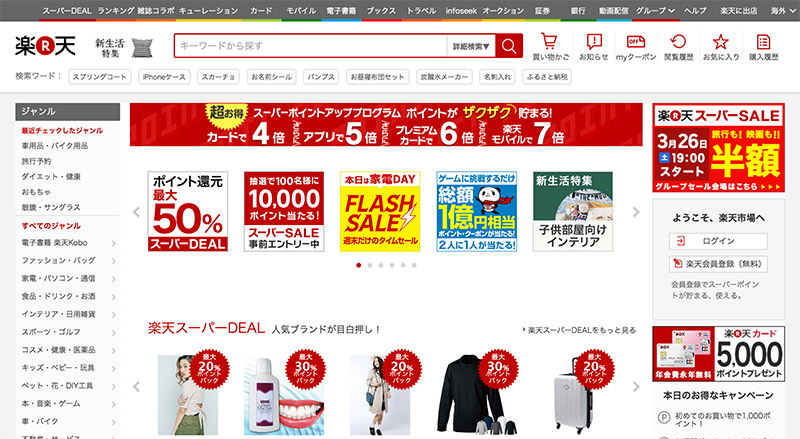
Rakuten
Kakaku

Goo

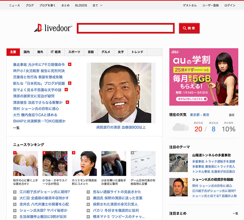
Livedoor
Hatena

Sankei

Now, I’m pretty sure that we have observed the same things about Japanese web design. To cut the story short:
- Japanese websites are very heavy in text.
- Heavy, HEAVY use of whitespace.
- Tons of (blue-colored!) hyperlinks and URLs.
- Advertisements, lots and lots of advertisements.
- Nearly no images, or if they are present, they are very small ones.
- Absolute disregard for an easy flow for the eyes to focus on.
- Flash-heavy. For banners, advertisements and slideshows.
Looking at them, these websites are almost like remnants of the 80’s and 90’s, when HTML was the crowning glory of web design. Some are even reminiscent of newspapers, see how dense the rows and columns are with text.
It is interesting to note that these websites all share these characteristics. Almost as if they were all designed with the same idea in mind. Now, what could that idea possibly be? To figure this out, let’s take a look at the following.
Mobile Culture in Japan
Before smartphones became a worldwide craze, Japan was already doing their own thing, years in advance. Mobile phone usage was such an ingrained part of their lives that they coined a term for it: mobile phone culture, or keitai culture.
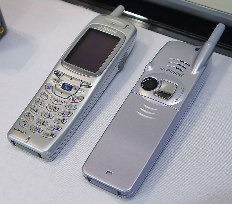
Before smartphones, there were camera phones, an industry that Japan was leading far ahead than the rest of the world. J-SH04, a mobile phone made by Sharp Corporation and released by J-Phone, started marketing in November 2000. It was touted as the first real camera phone, and could send MMS, e-mails, and even came with 3G technology.
Then came NTT DoCoMo’s i-mode, a mobile internet service got more than 50 million users within the first 3 years alone. Various services were launched and modified to go hand in hand with this new technology, and with that, several websites had mobile versions created.
Because this was the 2000s, and mobile phone technology wasn’t that advanced, a lot of focus was placed on making websites easy to navigate and view on a mobile phone.
While larger companies had the resources to create these separate designs for mobile users, smaller companies had to opt for single designs that were easy to view on both the computer and mobile phones. With that in mind, it suddenly makes sense why these websites look like they should be viewed on a phone – because they have to be!
As for the advertisements, Japanese corporations see websites as what they used to be: another way to advertise their product or the products of their partners. This is why these websites turn into the nightmare of every anti-ad freak.
Whitespace on the sides of the website are filled with animated advertisements. To the untrained eye, it becomes difficult to determine what is an ad and what is part of the actual website.
Web Design with the End User in Mind
Another important factor to note is that this type of web design did not result as a mere coincidence. Aside from optimizing them for mobile use, they were designed with the end user’s expectations in mind.
A Japanese user experience architect offers his own perspective on things, stating that these types of web designs stem from the very Japanese attitude of passivity. This means that as much as possible, information should be presented to them without them having to ask or poke around too much – kind of like offering them a very informative brochure.
This is different from Western web design, as they focus more on combining both being eye candy yet informative enough without overloading the user.
What also has to be considered is the popular browser of choice. For the longest of time, Internet Explorer has proven to be the popular go to choice for users (click the link first before you start tsk-ing).
As such, websites are designed with this in mind, and with IE, your choice for fancy website design is severely crippled. This, on the other hand, is alleviated with the heavy use of colors, which are reminiscent of the neon lights of the Tokyo cityscapes.
Linguistic Difference
Last but not least, Japanese typography also plays a large role. To the untrained eye, the unknown characters and symbols will appear cluttered and chaotic, as there is nothing to properly focus on (other than images, maybe). Japanese websites also tend to incorporate text into images, so when translated, it adds to the chaotic and unfinished feel.
The seemingly wordiness of the websites can also be explained as thus. Designers try to present as much information as possible, and while this may seem like a case of information overload, in a language you are familiar with say, English, this design is no different than the Yahoo! landing page.
There are links that take you everywhere, and text no matter where you look. It is not very pleasing to the eye, but it makes it easy to find information that you want and need somewhat easier.
That said, the trend these types of website design will probably keep up for a longer while, still. Although some companies have started breaking the mold, Japan’s attitude of conforming to things has allowed this type of design to survive for decades. With the rest of the world catching up with the mobile trend, let’s hope that Japan will do the reverse for the browser versions of websites.