The Fall of Apple (Infographic)
Let’s settle down for a moment. The topic of Apple’s potential downfall has been a subject of speculation for years, especially after the loss of its beloved CEO, Steve Jobs. But how likely is it that one of the world’s most valuable companies could falter? This infographic may offer some insights.
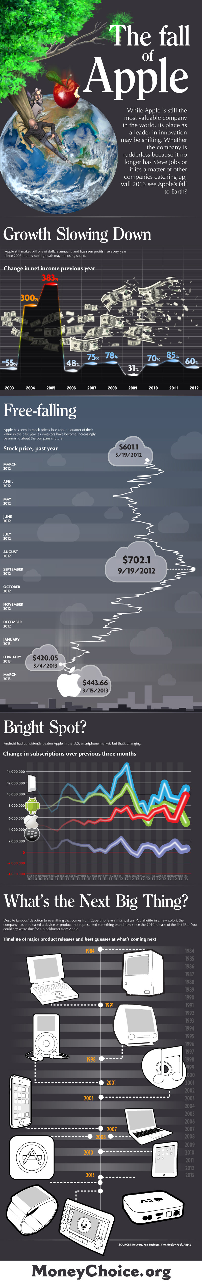
Explore the following infographic by MoneyChoice.org to see how Apple’s stock has performed over the past year, its slowing growth rate, and its standing compared to competitors like Android. Additionally, take a look at the timeline of Apple products, starting from the first Macintosh computer in 1984 up to upcoming releases like Apple TV and Smart Watch, as well as Siri integration in vehicles.
Related: Browse More Infographics Here.