Designing Beautiful Mobile App Websites
The mobile scene has grown exponentially over the past couple of years. The iOS App Store along with Android Apps on Google Play have become the two hotspots for smartphone enthusiasts. As the number of smartphone users increases we are seeing hundreds of mobile app developers launching new ideas into the market.
Most popular apps are accompanied by their own website. This can be helpful with marketing and getting your name out there. It’s also a much prettier online URL than either of the App Stores. I feel that any successful mobile application almost requires a web presence.
In this article I want to go over some of the most common design trends for mobile app websites. There is no strict rulebook you must follow for building such a layout. Rather there are some unique guidelines and trends which web designers have found to work well in gaining an audience. Coupled with my iOS Development Guide you can put together a fantastic mobile app and construct its website, too.
Check out these concepts below and try implementing some into your own application website layout.
Designing for Mobile Devices
The first iPhone revolutionized the tech world when it was released. Now, almost five years later, the smartphone... Read more
Device Screenshots
A staple piece for any mobile app website has to be screenshots of the application. Visitors are only interested in your app, and what quicker way to demonstrate its purpose than through screenshots? You can fit device shots into any layout style so it’s not a limiting factor.
Easy Chef is a Spanish iOS app which uses many device shots. The very top part of the layout has a slideshow preview of different views. But as you scroll down you’ll notice other diagrams using iPhone displays. These panels include detailed labels and upclose, magnified screen views. I have actually written about designing informative product graphics in an older post.

Another interesting setup can be found on the Tweetbot gallery page. This is a very popular Twitter client for iPhone and the developers have put together a sliding showcase of screenshots.
If you’re trying to save room in your layout, this may be an easier solution. Visitors won’t need to scroll down looking for a specific view. jQuery is easy to implement and you can quickly put together a sliding iPhone screen preview. It may be difficult to include extra details, but this can be added in another section.

App Store Badges
This technique also seems very no-nonsense once you’ve finished building the application. Badges are quickly recognized as download links to the app marketplace. Both Android and iOS users have the ability to view apps right from their browser, or this will redirect when viewed on a smartphone.
I like using Instagram as an example since the website had updated to a newer layout. They have badges supporting the Android Marketplace (Google Play) and iOS App Store.
Both badges are very simple in design yet easily recognized at a glance. If you’re looking for more complex designs, I recommend a quick dribbble search. Talented designers often share their app store badge concepts for constructive criticisms.

Mobile Social Networks
Facebook and Twitter have switched to mobile, but this hasn’t stopped other networks from sprouting up. We are seeing social networking use mobile apps to allow a whole new platform of communication.
Localmind (has since been acquired and retired) runs on a concept that is similar to Foursquare, where you register an account and start checking into local places. You can leave questions, or answer other people’s questions.
Their website is very friendly and inviting to newcomers. I especially love the top banner section designed with a custom map background. Their use of gradients and background texture give the website a life of its own.

Minimal Photo Sharing
Pose (retired) is another mobile network with similar ideals for minimalist design. You can download the mobile app for both iOS & Android devices. The feeling is similar to weheartit but it’s for mobile fashion lovers. The whole app is focused around fashion, hair, makeup, and glamor.
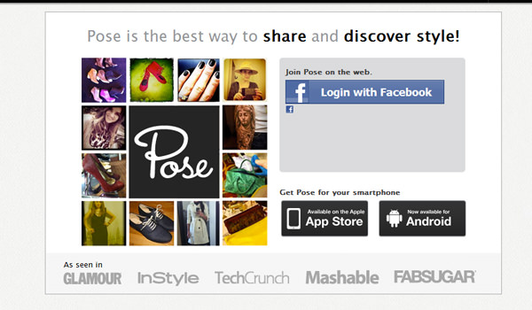
Users can take photos of their outfit, clothes, or accessories and share them around the network. One thing to notice about Pose is how quickly you can browse the website. It’s easy to find the company blog, contact details, etc. Other app websites often overlook these corporate features which can be a touchy subject.
If you want to draw attention from the media it’s important to make your website look and feel like a real social networking product. You are not only trying to sell your app (by ads or paid subscription) but also sell the network itself. Social apps can definitely be trickier than designing regular app websites. But they also garner a lot more downloads from users and it’s an exciting new field for mobile.
From Humble Beginnings
Web designers are not always capable of putting together outrageous graphics and icons. Thankfully app websites are not critical towards how much Adobe Photoshop prowess you have. I actually feel that minimalism can work much better for this layout style.
Leef App is a Forrst client for iOS. Their website includes a beautiful app screenshot along with a big bold download button. All of the page text is simplified in a similar manner to Apple’s fonts and color schemes.

What makes the Leef website great is the candid nature of each page element. It’s blatant and upfront with nothing hidden or pushed aside. I recommend trying this style as your first mobile app website, if anything just for practice. You can learn a lot by minimizing the lesser tidbits and concentrating on what grabs attention.
Lovely Whitespace
Also as brilliantly simple is the Wood Camera App website. Their layout holds nothing but a plain white background and centered content. This content includes some default screenshots, an app store badge, and some additional key features.

If you feel like minimalism and white space are important to your layout then stick with it! Wood Camera isn’t a particularly mindblowing website layout, but it is super easy to navigate. Their site doesn’t even link to any alternate content aside from the developer’s official page.
This keeps focus on the app and what it can offer, which is much more important than flashy graphics. Although that’s not to say flashy artwork is a bad idea – it just requires a proper implementation.
A New Way of Thinking About White Space
Uncover the secrets of white space in web design. Discover its influence from Bauhaus and Eastern art, and... Read more
Colorful Illustrations
Quite the opposite to the minimalist approach is a work with unique illustrations, which I totally adore. Often times this extra detail will completely sell me the app. One example I can relate to is the Barista App for iPhone. Their site header is riddled with little vector cappuccinos and espresso drinks.

But notice how there aren’t any other images when scrolling down the page. This whole top section was designed specifically for the iPhone app, similar to a landing page. The vectors catch your eyes right away and also hint towards what the app is about.