Beautiful Landing Pages (Tips and Examples)
Hundreds of witty articles have been written around the topic of landing pages. We all know the basic facts – that these are the pages a visitor reaches after clicking on a banner ad or a promotional link, and that they play a crucial marketing role by converting leads into customers for the business. When it comes to designing a landing page yourself, however, matters seem to be far more delicate than you would have expected after going through how-to documentation. This is why today, we have chosen to share a collection of actual landing page examples for inspiration.
According to a pretty scholarly classification you may find in Wikipedia, landing pages fall into two major categories: reference and transactional. If they are to be called a reference, pages have to display information that is both appealing and relevant to the visitor (text, multimedia). "Transactional" landing pages are the ones that aim at immediate sales or at least in capturing strong sales leads.
As you will probably agree with me, all landing pages meet both criteria: they inform the visitor upon the offer as well as incite actions from his side. Otherwise, we wouldn’t need calls-to-action on absolutely any landing page, would we?
What needs to be clear before launching any landing page in the www is the nature of the desired visitors’ action. Is increasing newsletter signups your goal? Then design a CTA with the message "Signup now to our newsletter". Do you aim to have trial purchases from visitors? Say so. Generally speaking, the essential recipe is to make your landing page express this offer as clearly and as enticingly as possible.
Coming Soon Pages & How to Do Them Right
For a coming soon page, all upcoming websites can ever do is to show an empty screen with... Read more
Tips for Designing a Landing Page
Some quick tips to start from when designing a landing page:
1. Use the AIDA principle
This is a chain of events that we desire to happen once a lead reaches the platform displaying the promoted product or service. Mainly, the steps are:
- Awareness – attract attention from the visitor
- Interest – which can be aroused by highlighting the benefits to the customer
- Desire – induce in customers the idea that they want the product or service
- Action – customers performing the purchase process
2. Not too many distractions; leave A way out
The idea is simple. If the landing page has virtually no navigation option except for the CTA button, visitors will force their exit. Don’t think that if you don’t provide any navigation, they won’t find a way to leave – they will, maybe even by shutting down the browser. And these visitors will not come back.
3. Make it pass the blink test
Typically, a landing page has to catch the visitor’s attention in the first 3 seconds of entry. If the guest blinks, and can’t see clearly what he should find on the page or isn’t interested with what he saw, he is most likely to bounce away empty-handed.
4. Don’t create false expectations
The landing page has to be consistent with the hints provided by the original ad, or vice versa. Visitors have to find on the landing page what they were first promised in the ad they clicked.
As we have promised, let’s tour some nicely designed and effective landing pages of B2B and B2C. We will explore their strengths and inevitable weaknesses. Watch out for the following in the gallery below: visual communication, branding and trust indicators, content effectiveness, calls-to-action.
Showcase: Beautiful Landing Pages
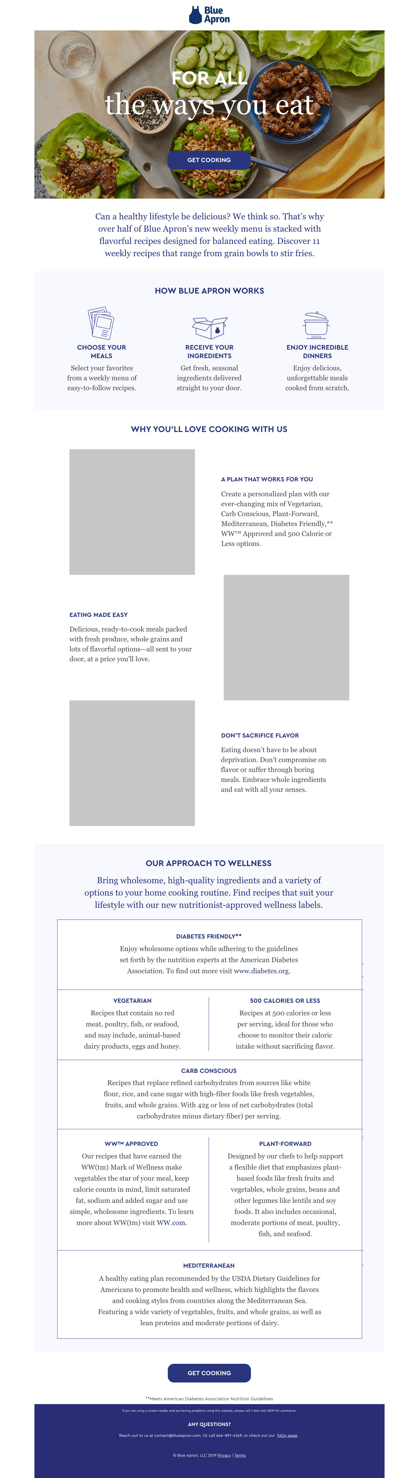
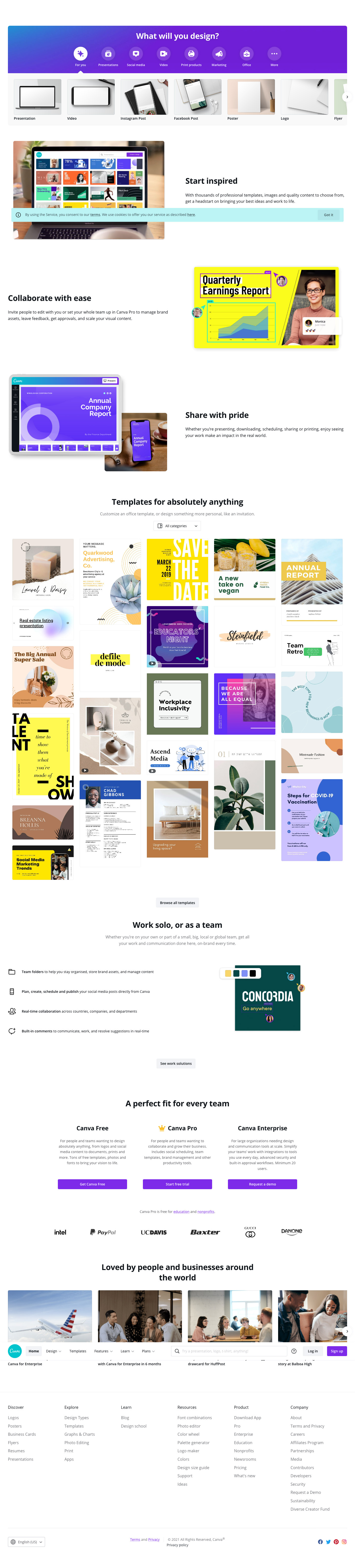
Click image to view full landing page.
Asana

Blue Apron
Canva
Deliveroo

Dropbox Paper

Spotify

Trello

Unbounce

Wise

AirBnB
