Facebook Redesigned: Analyzing Independent Designs
There’s a lot to learn by studying the work of other designers. This is true of both professional projects and spec designs for existing websites. Large sites like Facebook serve a very particular user experience with some good elements, and other not-so-good elements. In this post, I’d like to examine different Facebook redesigns to analyze interface concepts that could improve the current user experience.
I’ve pulled a handful of custom FB redesigns from Dribbble users, each with specific enhancements and updated UI elements. Take these ideas into consideration for how they look, how they might function, and how they could impact usability if implemented live on Facebook.
Read Also: 33 Beautiful Re-design of Popular Websites
Streamlined Profile Page
This profile page redesign comes from Haris Jusovic, a designer from the Balkan region of Europe.
In this design he places more focus on simplicity by highlighting the page owner with a more prominent header photo and profile pic.

Timeline posts can be sorted by “recent” or “popular” based on your preference. This is big for usability, especially in the wake of Twitter’s backlash against the recently-mandated algorithm change.
Also many of the buttons display larger with extra padding and bigger typography. Since Facebook is meant to be interactive it only makes sense to increase visibility of items like buttons and hyperlinks.
Overall this concept feels compact and lighter in bloat. It would be nice to see Facebook place more of a focus on interactive elements and maybe increase their font sizes, too.
Multi-Column Timeline
Veering towards a vertically columnal layout is Alejandro Osorio’s redesign. This layout represents the profile timeline view that Facebook users see when they visit a user’s profile page.
The design is striking but can be off-putting to some users. It relies on multiple page columns to organize the user’s profile links, along with a timeline view of recent posts. All the colors and elements stay true to Facebook’s design styles. It certainly feels like a Facebook timeline page.

But some of the sidebar elements do come off as slightly confusing. For example, a green button with a single plus sign right beside a “follow” button. One uses just a symbol, the other just text. This feels incongruent with the design style and other profile info.
What I like most here is the clear structure of data in the timeline. Everything is organized clearly and there are even sidebar links to switch between recent posts and popular posts.
Content-Dense Redesign
Larger websites like Facebook deal with much more data and a userbase that wants easy access to that data. In the homepage redesign by MagicVoltage you’ll find one consistent feature: lots of content crammed into one page layout.
Facebook’s homepage is the initial timeline view that users see when first visiting the website. It includes recent posts from friends, a chat list, games, ads, and other relevant info like upcoming birthdays.
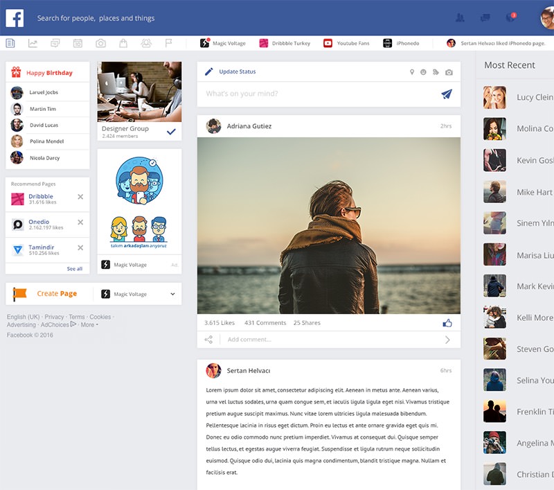
The busy-ness of this layout is what makes it both great and potentially controversial. Having all this content on one page makes it super easy to navigate – once you actually learn where everything is located. And the top-left icon links are just vague enough to dissuade anyone from interacting with them.
But in defense of this design it handles densely-packed content very well. There’s plenty of whitespace between elements and it runs a four-column design brilliantly.
Voluminous Navigation
This so-called Facebook 2.0 redesign created by Marcelo Silva is really a sight to behold. His demo layout displays an updated homepage with a timeline and partially-hidden chat contacts.

A big piece to this design is the tiered navigation system. I like how there’s a primary nav with icon links that display secondary links. In the above screenshot the user is selecting the profile icon which has links for browsing recent history and editing the profile.
Unlike Facebook’s traditional square photos, Marcelo’s redesign opts towards the circular photo. This style is ubiquitous in both the timeline and the chat list.
M Assistant & Recent Activity List
There’s a lot to be said about Steven McCabe’s FB redesign. In fact, many areas like games and recent activities have been completely redesigned with an impressive facelift.
Steven’s design is much darker than Facebook’s current color scheme. I like this because it builds more contrast between sidebars and primary page content. Facebook’s current homepage has most of this content but over time it can blend into the background.

The header still uses red bubbles to signify notifications. There’s also trending posts and a newsfeed with the ability to sort through recent activity from friends in the right sidebar.
At the very bottom you’ll notice a small box for Facebook’s M, the equivalent of Siri for Facebook users.
This feature doesn’t get much attention in redesigns but Steven really went all-out to make his concept truly represent modern Facebook technology.
Four-Column Timeline Layout
Here’s another 4-col homepage redesign made by Japanese designer Sho Kameya. All of these columns span the entirety of the page, both width and height.
The far-left sidebar places heavy focus on traditional Facebook links for games, apps, pages, dev resources, and other similar items. Next is the content column which is the most diverse among all the redesigns. This does not keep the traditional links for update status/add photo but instead uses a minimalist approach with hidden options.

The two right-hand sidebars include everything else with more photos like user avatars and game icons. This design still keeps all the updates like birthdays, chats, and friend recommendations.
This design is very diverse but stays true to the core of Facebook’s features. It may not be the perfect redesign but it shows the possibilities of a four-column layout.
Simplified UI with Dark Chat List
The goal of Ben Hartley’s redesign is simplicity and subtlety. The layout uses a combination of flat design concepts with a few drop shadows on larger page elements.
Many branded items remain the same and he relies on Facebook’s traditional blue/grey color scheme. But you’ll notice some of the icons have been redesigned either smaller or simpler (or both).

This layout also relies on circular avatars and gives plenty of room for images shared with posts. I really enjoy his updated chat list with the darker color scheme and smaller status icons.
While Ben’s redesign still feels a little cluttered, it does feel a lot simpler. This would be a tough design to gauge user experience without UX studies in a browser. But at a glance it seems easier to browse and gives more room to consume timeline content.
Wrap-Up
Although these examples focus primarily on Facebook, the lessons learned can be applied to any website. Great user experience design transcends all language barriers and it’s a vital piece of the digital creative process.
Feel free to borrow ideas from this analysis and even implement similar ideas in your own project work. Also if you find any relatable Facebook redesigns feel free to share in the comments with your own analysis.